Fruitist Arabic Campaign Localization
Arabic messaging and typographic design for Fruitist GoBerry!, bringing the campaign’s playful character to the UAE retail market.
- Client
- Fruitist
- Market
- UAE
- Sector
- Fresh Produce
- Year
- 2026
- Services
- Arabic Campaign Localization & Typographic Design
- Creative Lead
- Nihad Taisir
- Studio
- Nihad Taisir Studio
The challenge
Fruitist’s GoBerry! campaign paired short, playful English headlines with bold, expressive typography. Localizing it for the UAE required both the language and its visual character to work naturally in Arabic.
The challenge was to recreate the intent, humour and rhythm of the messages, then develop an Arabic typographic treatment that felt equally distinctive within the existing campaign.
Localizing the message
Each headline called for its own approach. We considered what the English line communicated, how it sounded and how the same idea could connect with Arabic-speaking shoppers.
The resulting copy used concise, conversational Arabic, with phrasing shaped around the campaign’s light-hearted tone.
These choices gave the Arabic messages their own rhythm while keeping them connected to the English campaign.
Creating the Arabic typographic voice
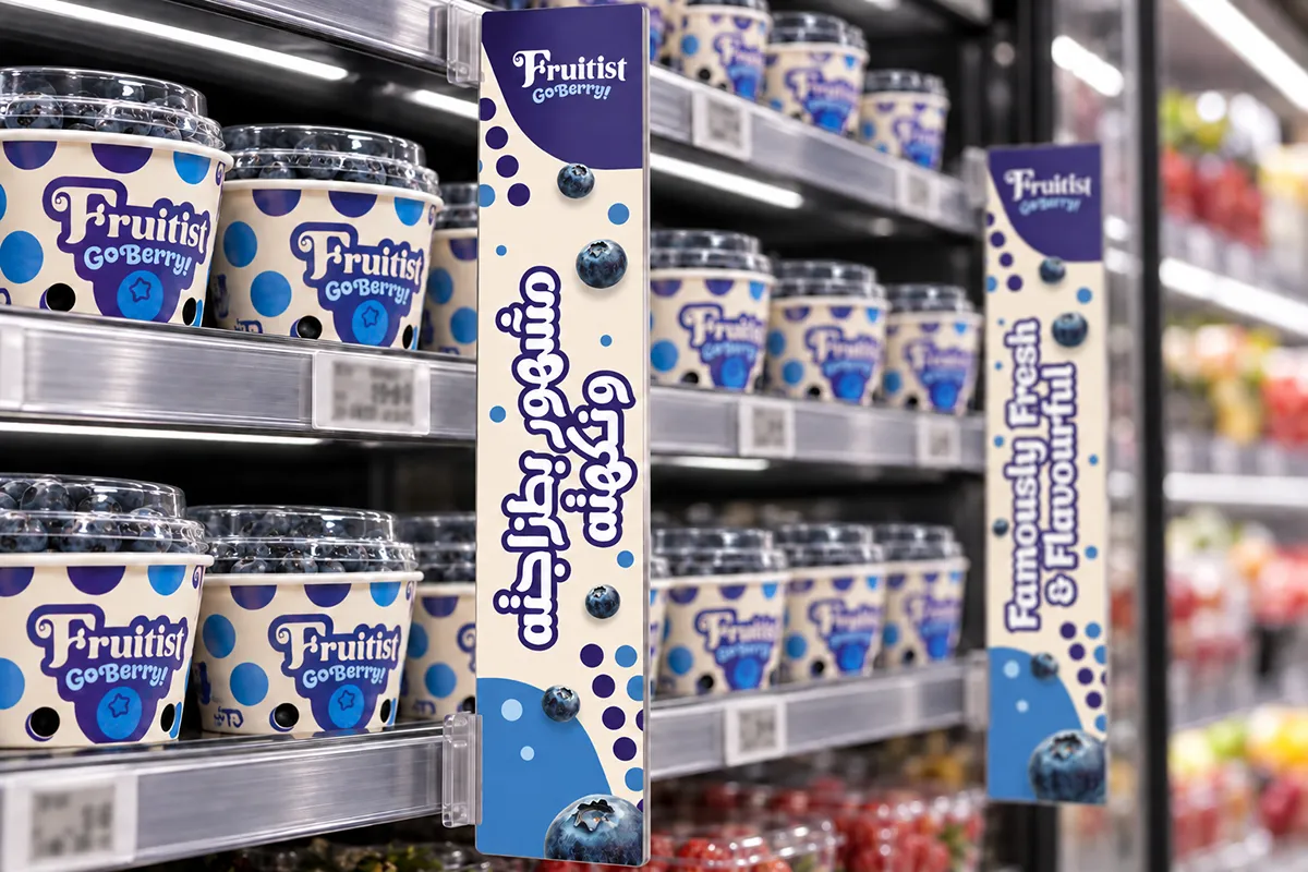
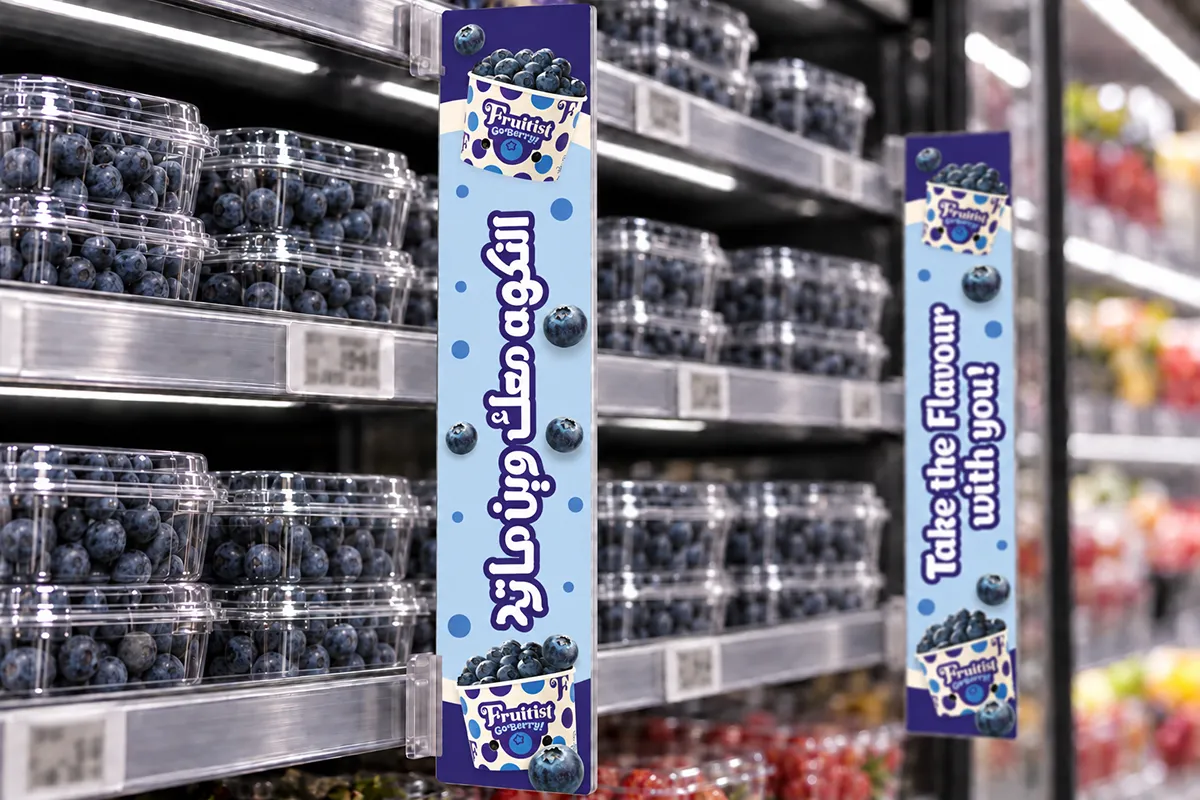
The Arabic lettering was developed alongside the copy. Its rounded forms, substantial visual weight and expressive word compositions echoed the character of the English typography while respecting Arabic letter structures and connections.
Proportions, spacing, dots, outlines and line breaks were considered together. Each phrase needed to function as a distinctive graphic expression and remain readable within the retail format.
The two languages shared a recognizable campaign personality, with room for each to follow its own linguistic and typographic logic.
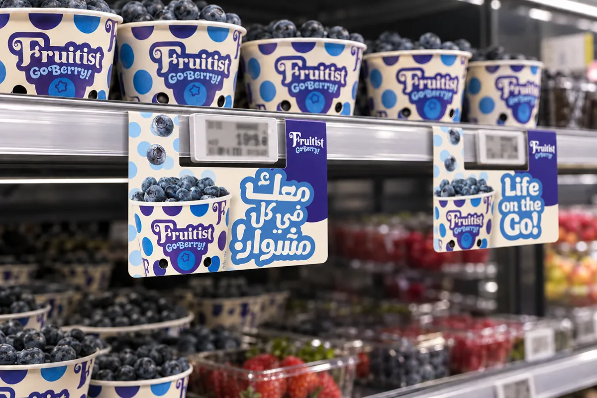
Bringing the campaign into retail
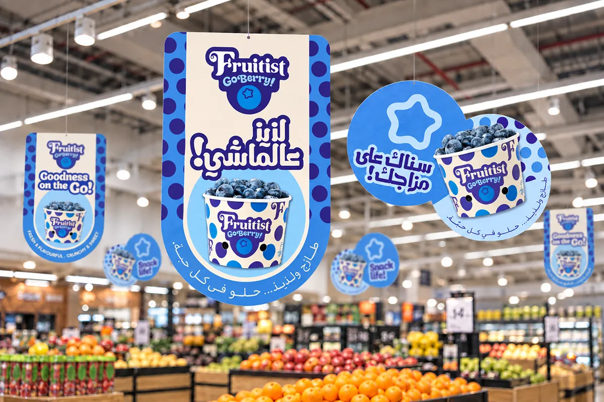
The localized messages and Arabic typographic treatment were applied across hanging danglers, shelf talkers and dividers for the campaign’s Carrefour UAE point-of-sale materials.
Each application was refined for its format, with attention to message hierarchy, product imagery and bilingual consistency. Following approval, the artwork was prepared for production.
The outcome
A cohesive English–Arabic retail campaign that retained Fruitist’s established character while giving its Arabic communication a natural voice and a distinctive typographic presence.
The project brought translation, creative copywriting and typographic design together, with the retail applications carrying that work into context.
Scope of work
- English-to-Arabic campaign localization
- Arabic transcreation and copy editing
- Custom Arabic typographic treatment
- Bilingual POS adaptation
- Final artwork and production preparation
Project credits
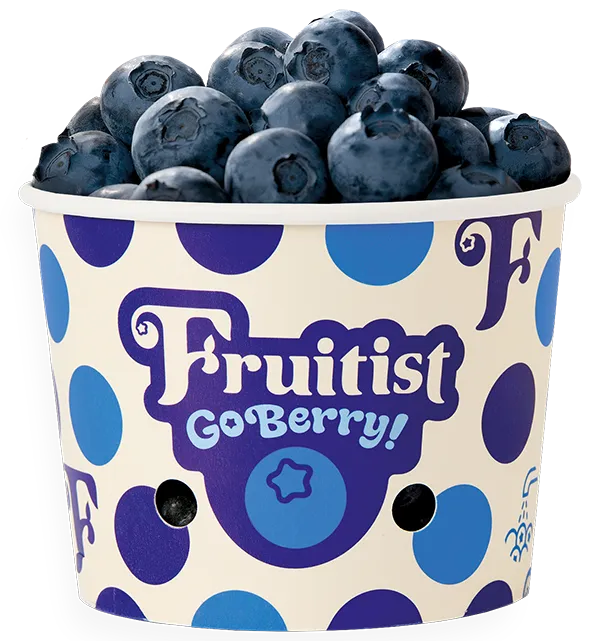
Original Fruitist brand identity, packaging and English campaign materials supplied by the client.
Arabic campaign localization, typographic design, bilingual POS adaptation and production artwork by Nihad Taisir Studio.
Retail scenes are illustrative mockups, not photographs of the installed campaign.