PORTFOLIO

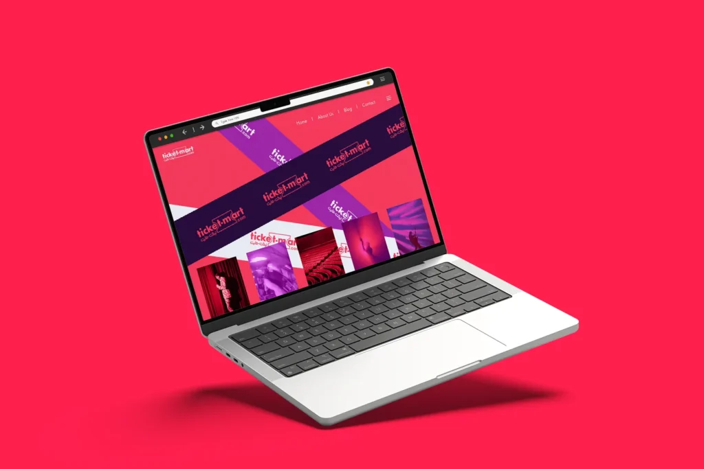
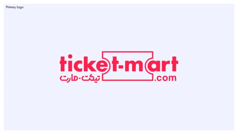
Ticket-Mart.com Brand Identity

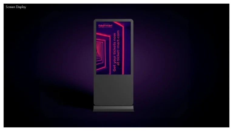
Full brand identity for a GCC-based ticketing platform, designed to balance trust, speed, and entertainment across digital and app-first touchpoints.

Brand
Ticket-Mart.com
Service
Brand Identity
Sector
Ticketing & Entertainment Platform (GCC)
Deliverables

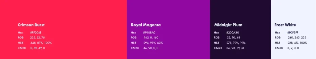
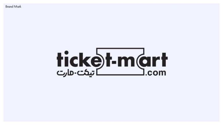
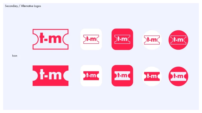
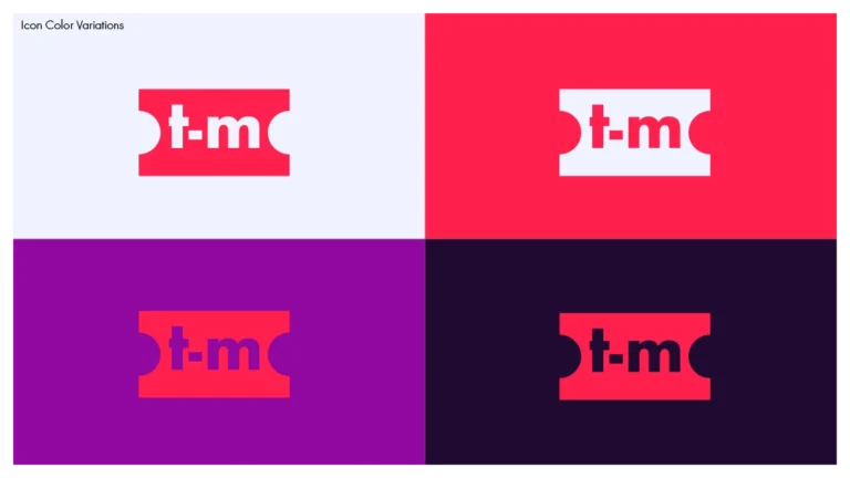
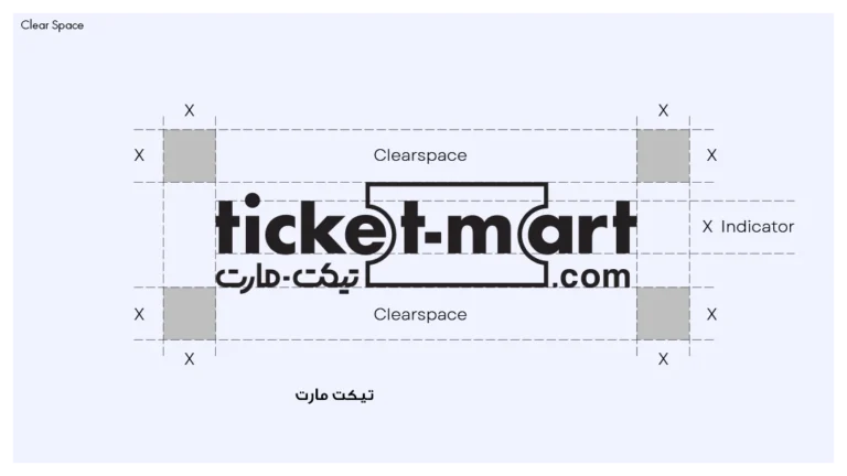
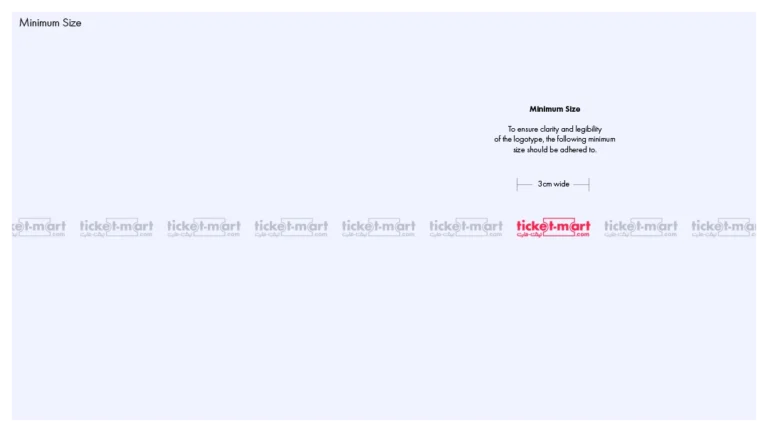
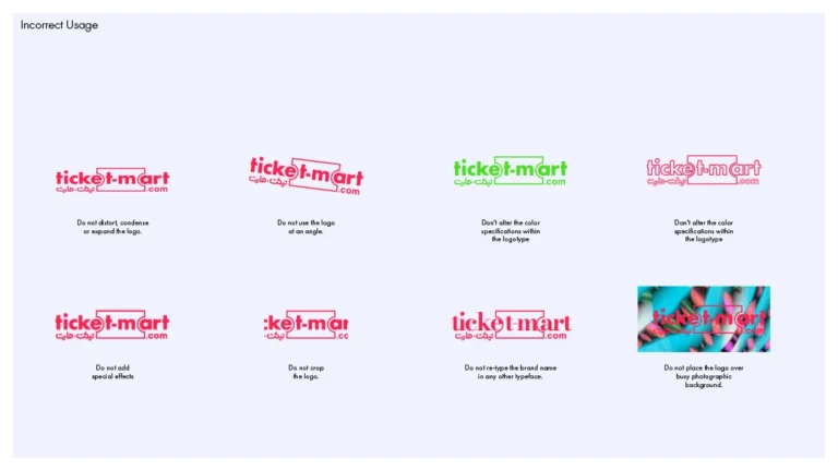
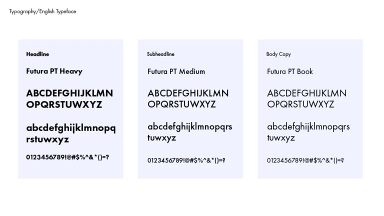
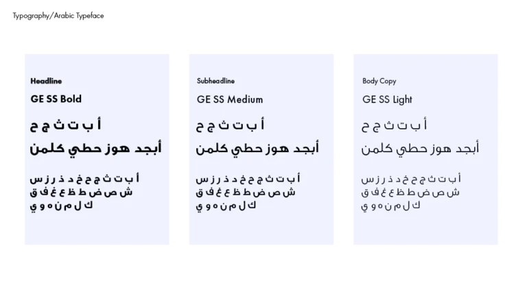
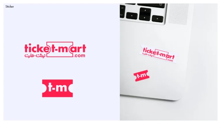
Logo system, bilingual wordmarks, app icon, brand patterns, and identity guidelines

Ticket-Mart.com logo design banner

Project Overview

Ticket-Mart.com is a ticketing platform serving events, entertainment, and attractions across the GCC. The goal was to create a brand system that feels energetic and engaging without sacrificing credibility or usability.

Rather than relying on visual trends or decorative symbols, the identity was built as a functional system. One that works at small sizes, scales across platforms, and remains immediately recognizable in fast-moving digital contexts.

The Challenge

The challenge was balance.

Ticket-Mart.com needed to communicate excitement and entertainment while maintaining trust and professionalism. The brand had to feel fast, accessible, and modern, without appearing casual or disposable.

At the same time, the identity needed to support:

  • App and favicon usage
  • Social and promotional assets
  • Bilingual environments
  • Long-term scalability beyond a single market
Ticket-Mart.com website design

Brand Strategy & Concept

The identity was built around structure, not ornament.

The core idea was to embed the function of ticketing directly into the brand itself. Ticket geometry was integrated into the wordmark, allowing the logo to communicate purpose instantly without relying on additional symbols.

A compact “t–m” icon was developed as an app-first mark, designed to work clearly at very small sizes. The bilingual lockup was engineered for legibility and balance, ensuring both Arabic and English could coexist without visual conflict.

Every decision prioritized clarity, usability, and recognition over novelty.

Logo System

Multiple directions were explored during development. The client approved Option 1 and Option 2, both of which were designed to coexist within the same system.

The final logo system includes:

  • Primary English wordmark
  • Arabic wordmark (تيكت-مارت)
  • Compact “t–m” icon for app and digital use
  • Flexible lockups for different screen ratios and placements
Logo Options-ticket-mart-Logo System

The system was tested across light and dark backgrounds, ensuring consistency across all brand environments.

Color Palette

The palette was designed to support both energy and control.

Primary colors use bold, expressive tones suitable for entertainment platforms, balanced with neutral values to maintain readability and hierarchy. The system allows vibrancy where needed, without overwhelming functional interfaces or brand applications.

Color usage rules were clearly defined to prevent fragmentation as the brand scales.

ticket-mart Branding Color Palette

Typography

Typography was selected for clarity, legibility, and digital performance.

The type system supports:

  • Fast scanning

  • Clear hierarchy

  • Consistent rendering across devices

Arabic and English typography were treated as equal components within the system, aligned in weight and rhythm rather than forced into visual symmetry.

Fonts ticket-mart Branding

Applications

The identity was applied across a range of brand touchpoints, including:

  • Business cards
  • Social media assets

  • App icon and favicon

  • Pattern system derived from the logo structure

  • Demonstration mockups showing digital brand behavior A

All applications were designed to reflect real-world usage rather than conceptual styling.

Deliverables

The final delivery included:

  • Full logo system
  • Pattern system with source files
  • Brand color palette
  • Typography specification
  • Brand guidelines
  • Selected brand applications

Final files were delivered in:

  • AI, SVG, PDF, PNG
  • App icon and favicon sizes

Outcome

The Ticket-Mart.com identity establishes a clear, modern foundation for a scalable ticketing platform. By focusing on structure, legibility, and system thinking, the brand is positioned to grow across markets while remaining consistent, recognizable, and trustworthy.

This project demonstrates how functional branding decisions can elevate a digital platform without relying on visual noise or short-term trends.

READY WHEN YOU ARE

Turn Arabic into a brand system, not a decoration.

If your brand lives in Arabic or bilingual markets, I can design an identity that reads with clarity, holds its form, and scales across teams and touchpoints.

Best fit: cultural brands, institutions, publishers, and agencies working in the Middle East.

Get in touch

Typically replies within 1 to 2 business days.