Al Saada Brand Identity Refresh
Arabic-first brand refresh for a Dubai government social program, upgraded for clarity and consistency without breaking recognition.
Strategy and concept
Al Saada needed a refresh that felt clearer and more confident, without breaking recognition. The work focused on system, proportion, and restraint so the identity could scale across many touchpoints and remain consistent over time.
The core challenge
Al Saada had to balance institutional credibility with a positive, human tone. The brand needed to communicate optimism without becoming playful, and formality without becoming cold.
Client brief
The client came with an existing identity already in use. The goal was not a full redesign, but a structured refresh that improves Arabic typography, clarifies the visual system, and strengthens long term consistency.
Objectives
- Refresh the Al Saada logo while preserving recognition.
- Improve Arabic typographic quality and consistency.
- Establish a clear and flexible color system.
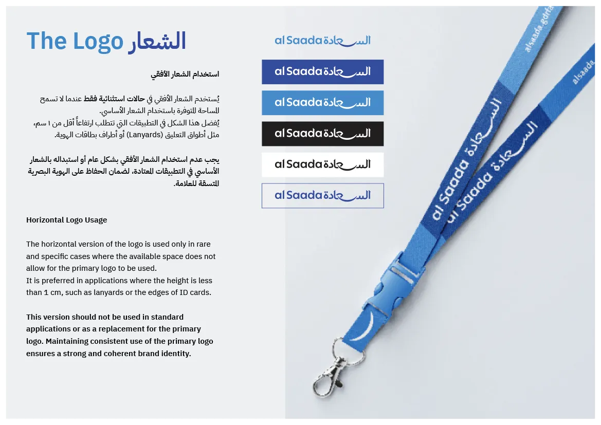
- Redesign the card design and key brand assets.
- Build visual guidelines that protect consistency across teams and partners.
Key constraints
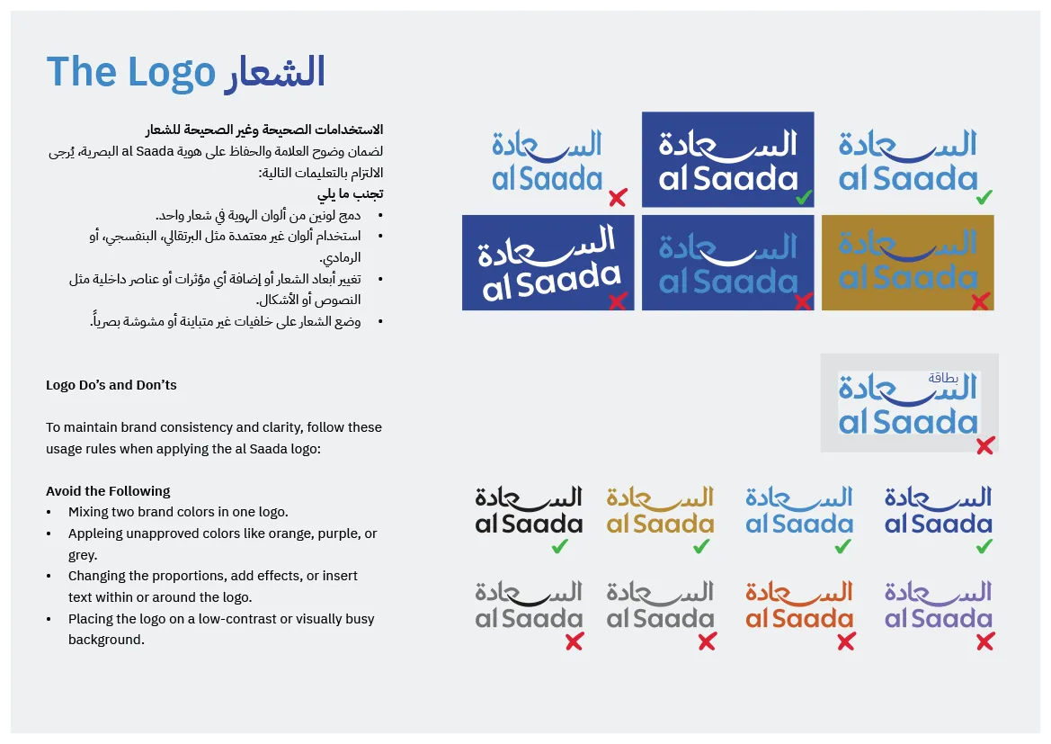
- Do not break recognition.
- Keep the identity governmental, clear, and trustworthy.
- Arabic leads the brand, with English aligned carefully.
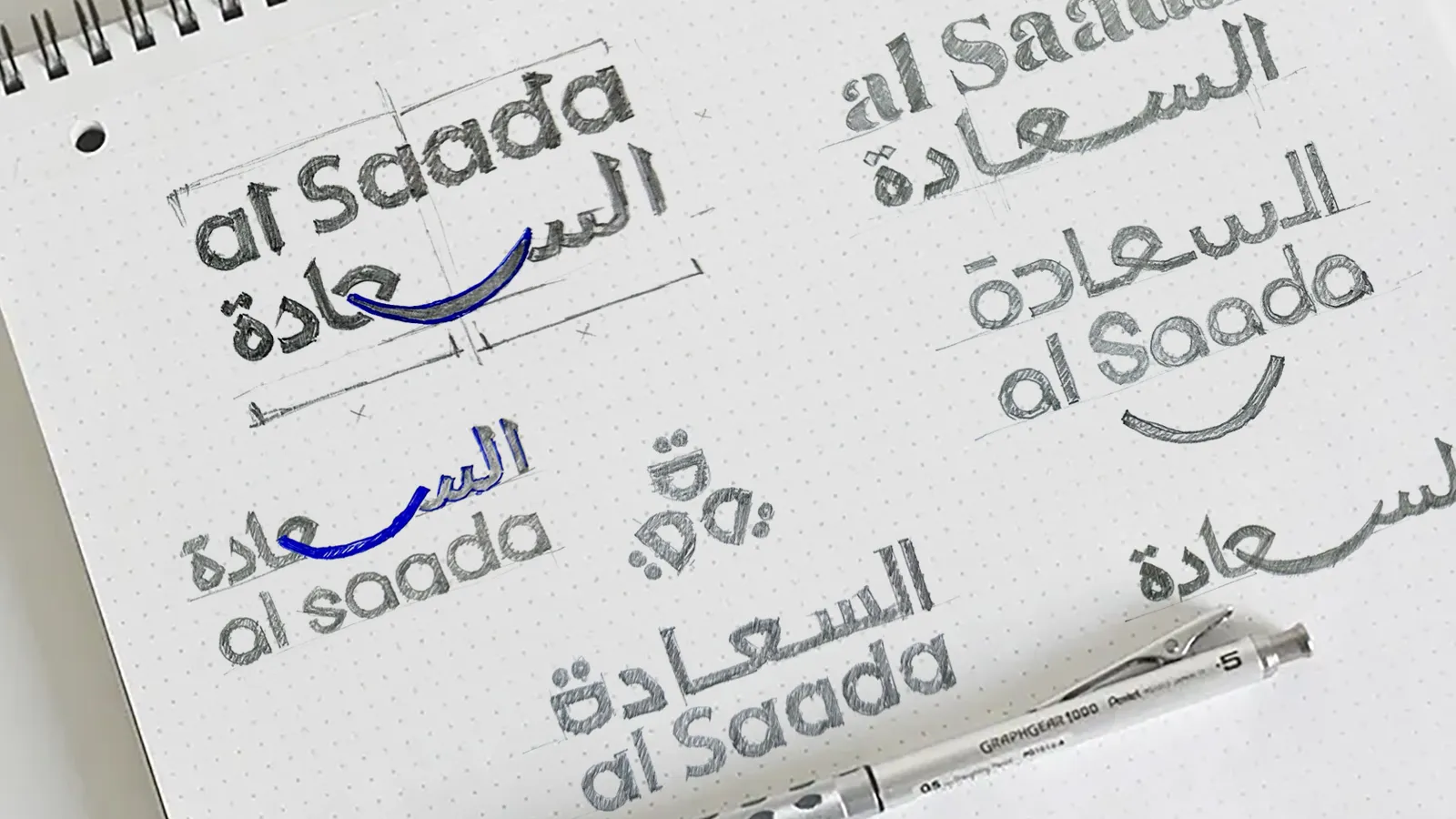
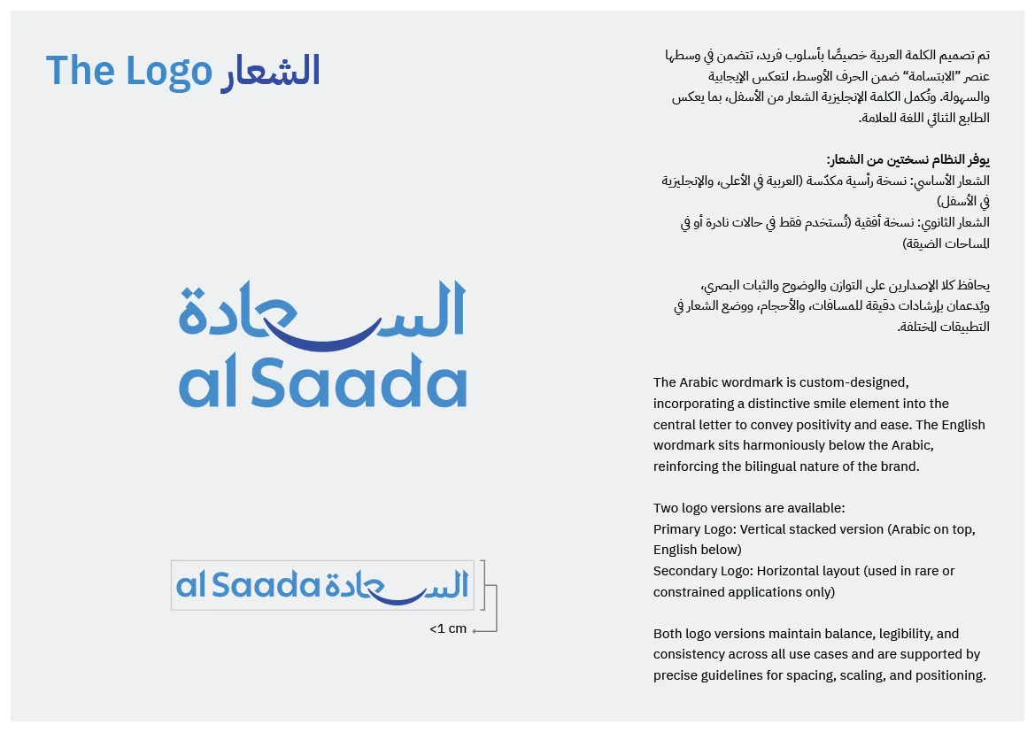
Logo strategy
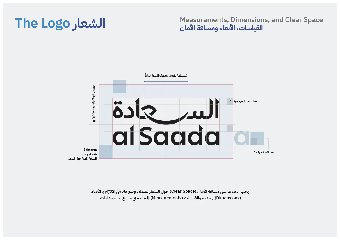
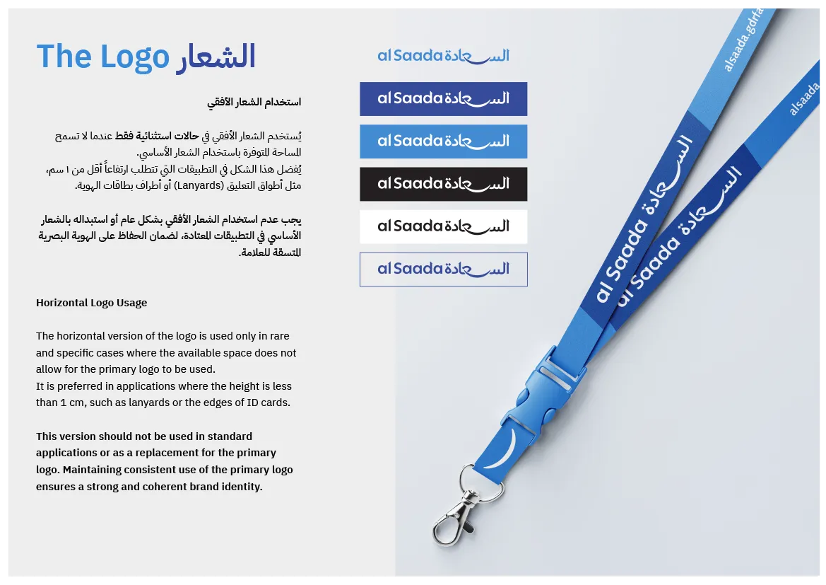
The redesign followed an Arabic first approach. The Arabic logotype was drawn and refined to feel culturally grounded, readable, and stable at small sizes. The English was adjusted to match the Arabic proportions and weight so both languages feel part of one system.
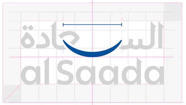
The smile element
A central design decision was the smile. It sits at the visual center and connects the Arabic and English components. It is structural, not decorative. It sets the logo’s geometry and carries the brand’s emotional tone.
Logo development process
Multiple directions were explored and tested for readability, cultural fit, and scalability. The chosen direction was the one that stayed clear at small sizes, worked across official applications, and avoided trends that date quickly.
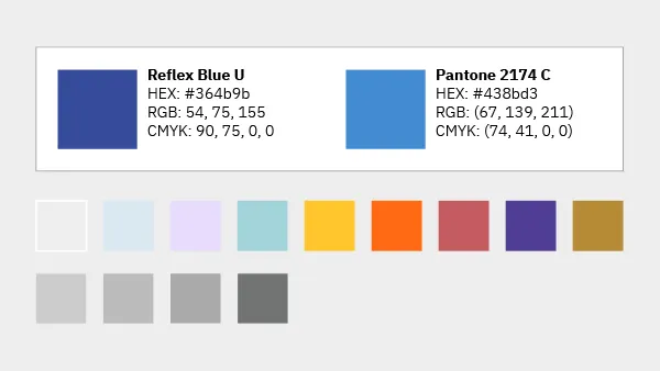
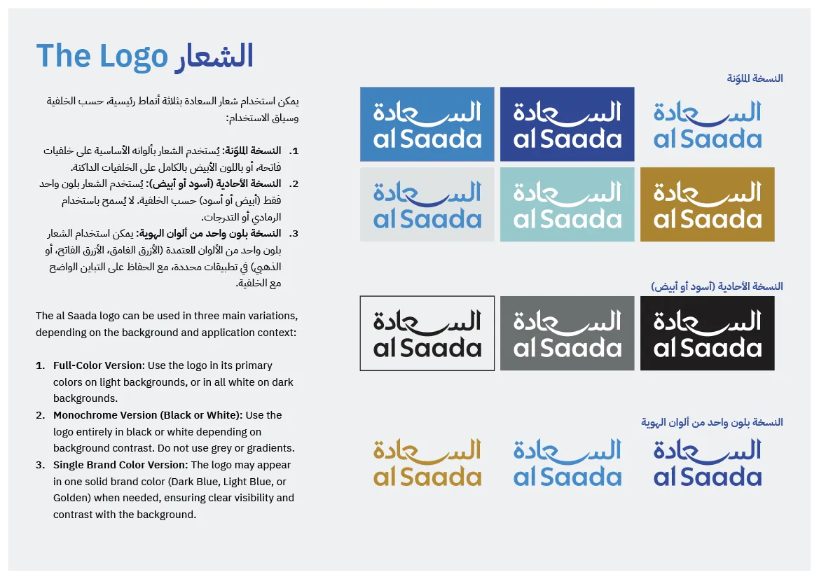
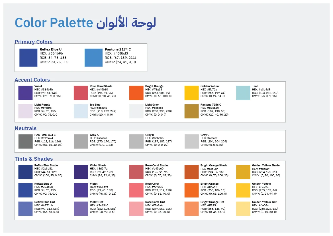
Color system
Two blues form the foundation of the identity. The dark blue anchors authority and clarity. The light blue adds openness and approachability. A refined gold accent was retained for hierarchy and emphasis, used sparingly. Supporting colors were introduced in a controlled way to help designers and maintain consistency without fragmenting the system.
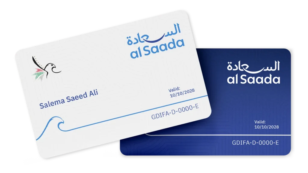
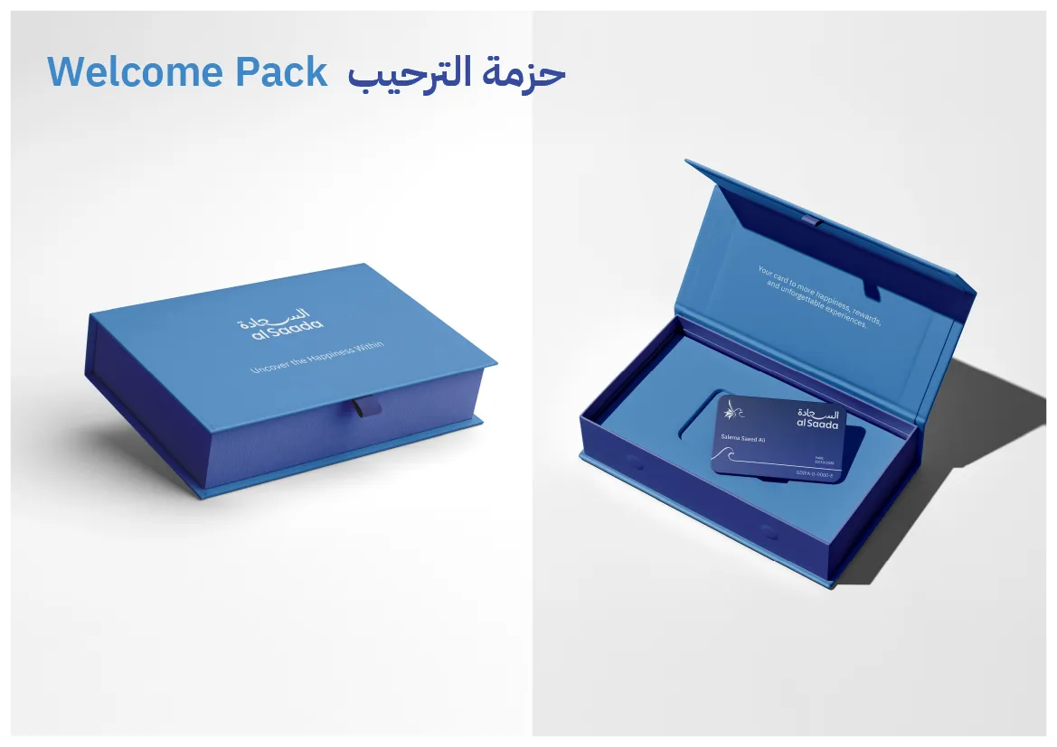
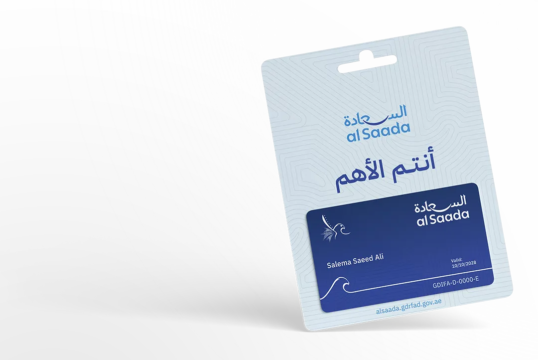
Card design
The card was treated as a key brand anchor. The design prioritizes clarity, security, and hierarchy. A subtle pattern derived from brand geometry supports the identity without adding noise. Two versions were defined for different use cases: a light version for clarity and print, and a dark version for premium or digital contexts.
Outcome
The final identity delivers a modern Arabic first system with strong consistency, a clear positive tone, and long term flexibility. It shows how disciplined Arabic branding can elevate a government program into a coherent, trusted brand experience.


READY WHEN YOU ARE
Turn Arabic into a brand system, not a decoration.
If your brand lives in Arabic or bilingual markets, I can design an identity that reads with clarity, holds its form, and scales across teams and touchpoints.
Typically replies within 1 to 2 business days.