Portfolio

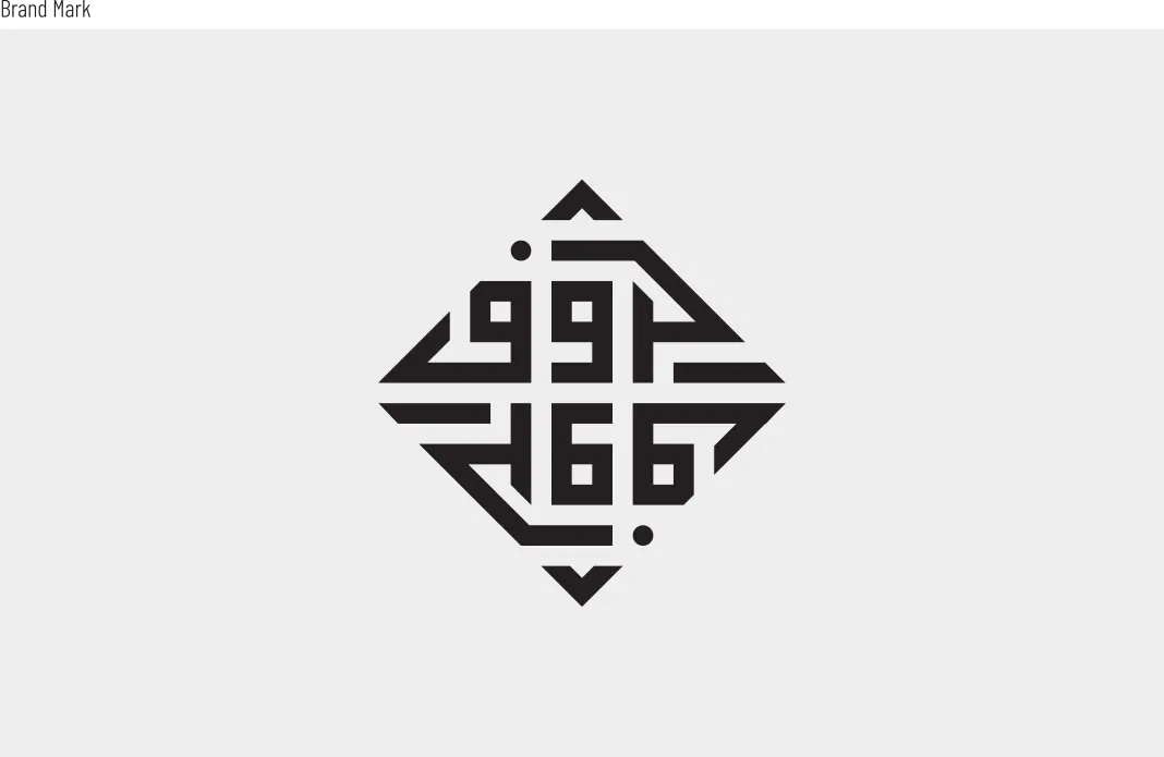
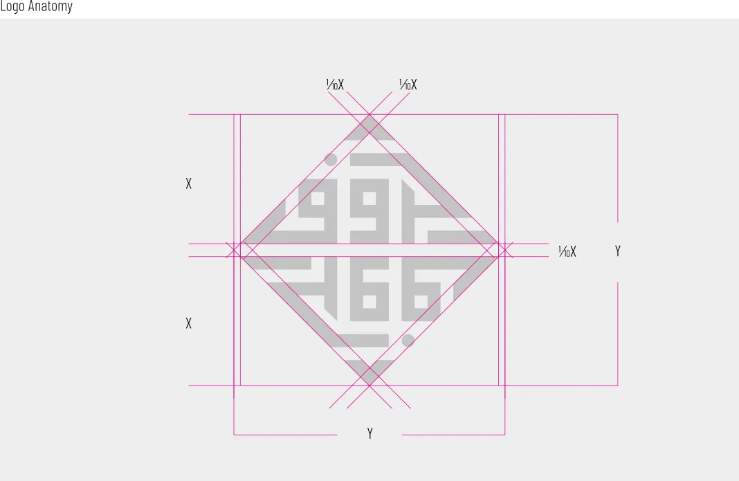
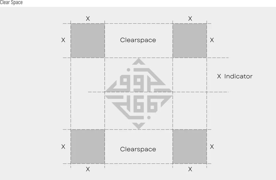
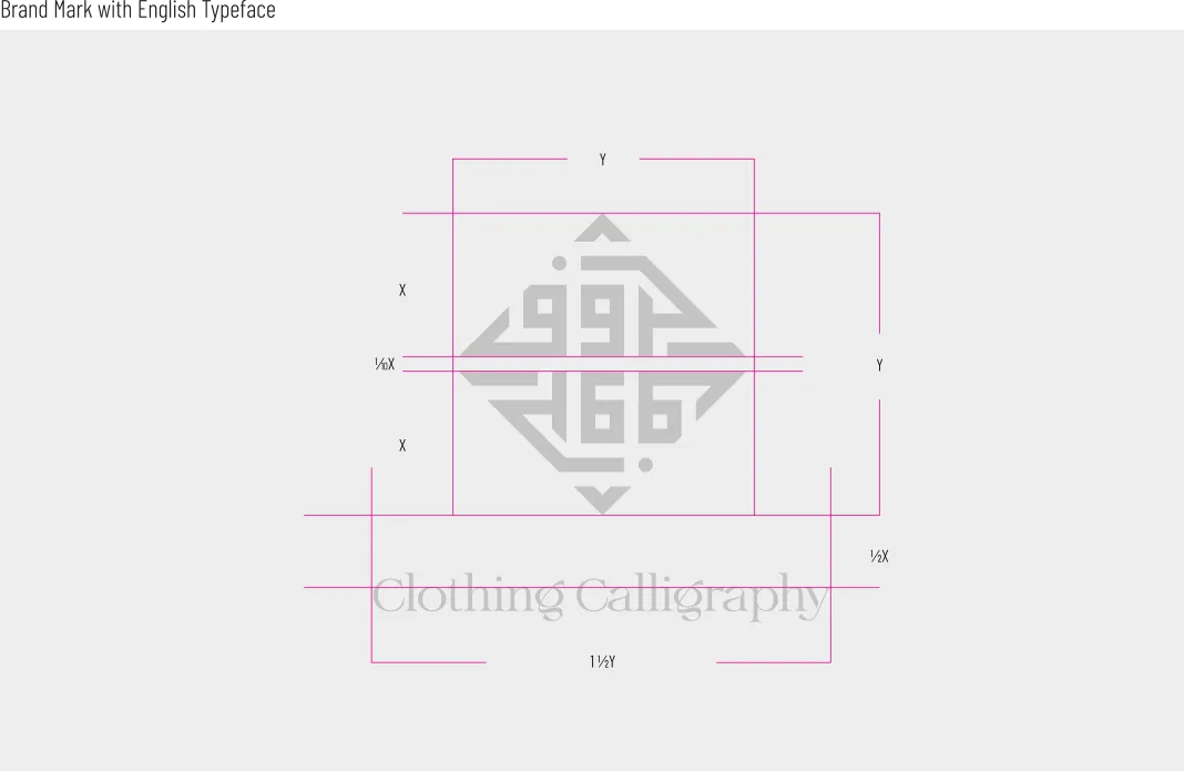
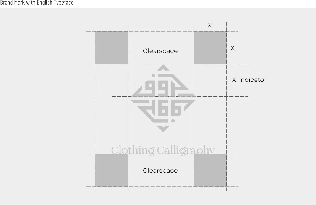
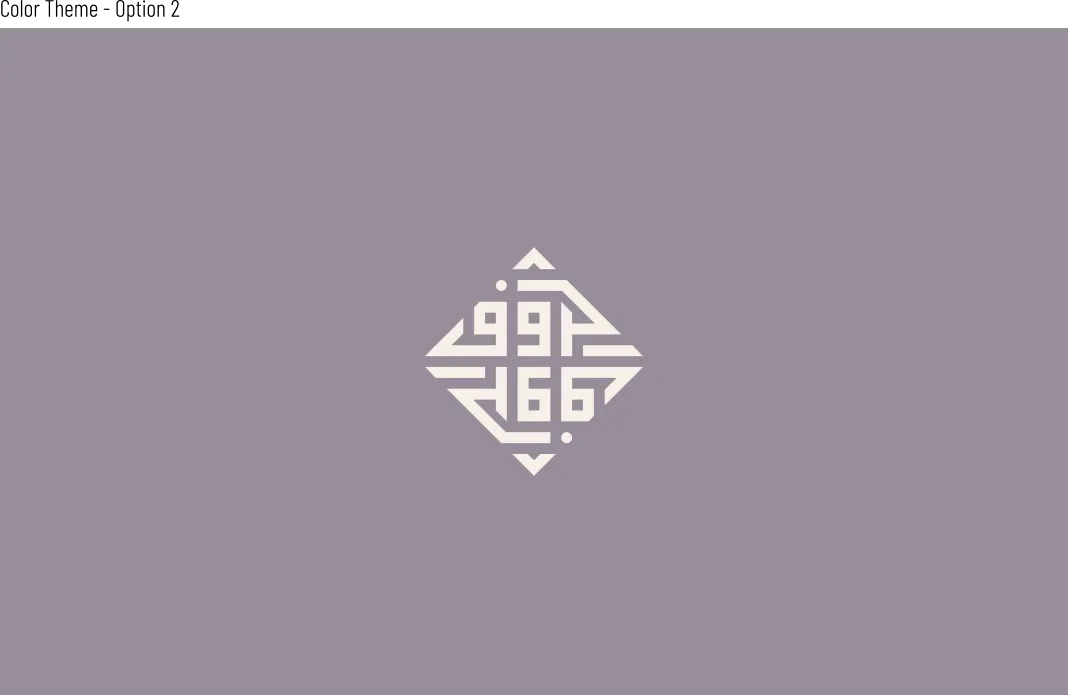
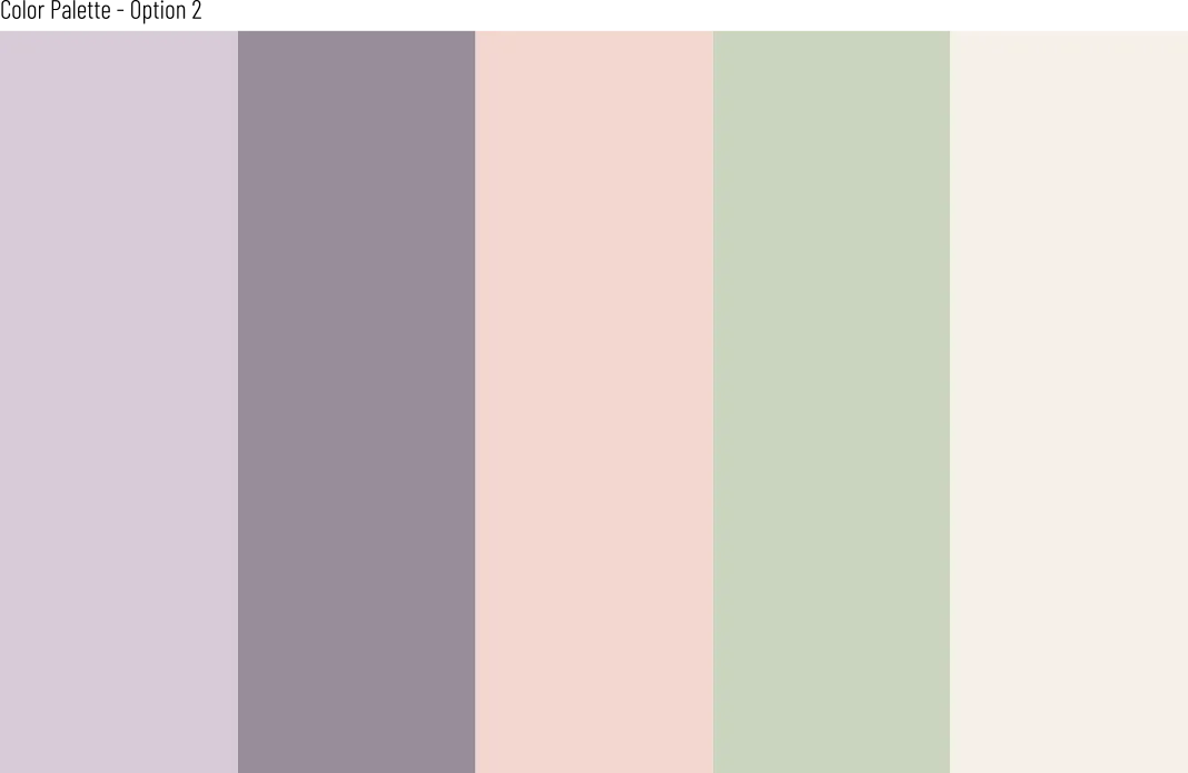
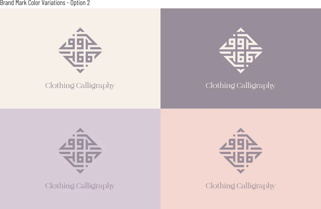
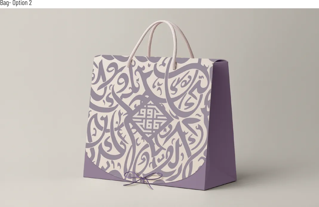
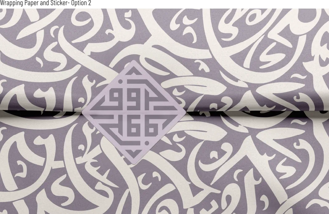
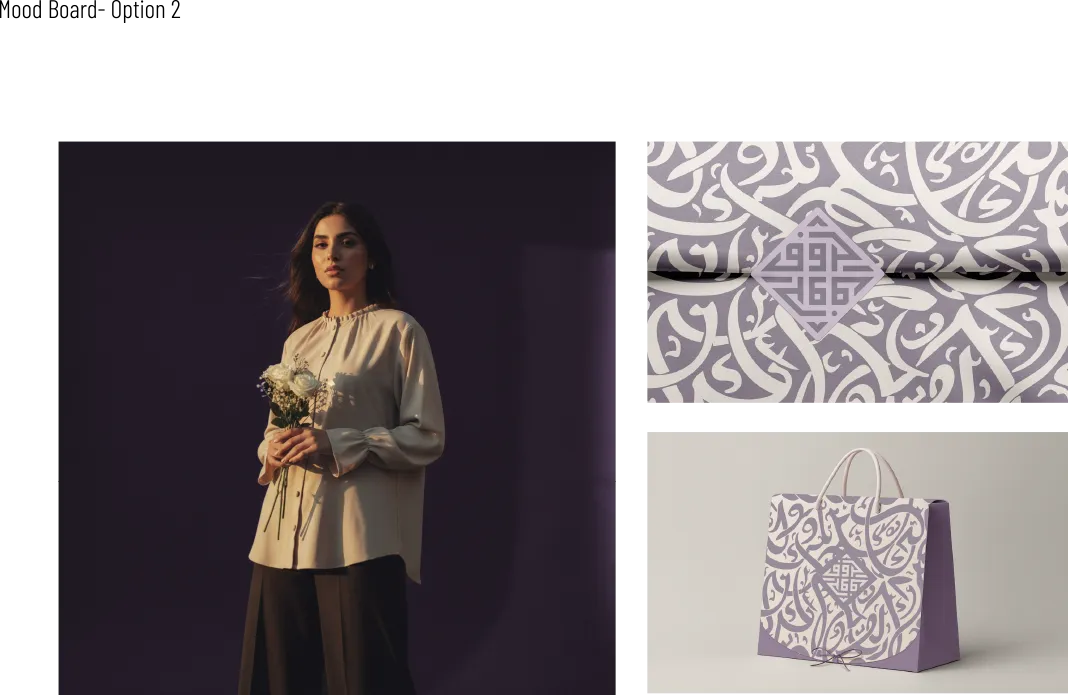
Haroof (حروف) Brand Identity

Brand identity system for a women’s fashion label inspired by the meaning and form of Arabic letters.

BrandHaroof (حروف)
ServiceBrand Identity
SectorWomen’s fashion
DeliverablesLogo, palette, packaging, toolkit

Strategy and concept

The direction focused on making the Arabic letter feel like a structure, not an ornament. Geometry and proportion were used as a visual language to express balance, meaning, and restraint.

Creative brief

Haroof is a women’s fashion label inspired by the soul of Arabic letters. The identity needed to feel culturally rooted, feminine, and refined, with a clear system that can expand across collections and packaging.

  • Arabic-first identity, with English as a supporting layer
  • Elegant tone with restraint
  • Meaning before decoration
  • A system that scales across touchpoints

Brand idea

The brand treats Arabic letters as both meaning and form. Each collection can be inspired by a single letter, turning language into a visual signature that feels modern, minimal, and timeless.

Design directions explored

Multiple directions were explored to find a form that feels iconic, geometric, and fashion-appropriate. The goal was to avoid illustrative calligraphy and instead build a strong mark with clear structure and symmetry.

  • Geometric compositions and grid-based layouts
  • Vertical and compact structures for strong recognizability
  • A refined silhouette that works on small labels and packaging
Final Haroof Arabic logo in Square Kufic style

Final logo system

The final mark uses a Square Kufic approach to build a balanced, symmetrical Arabic wordmark for “حروف”. The result is a compact signature that holds its shape across sizes and applications.

  • Primary Arabic mark designed on a grid
  • Monochrome-ready for production
  • English descriptor used as a supporting element when needed

Construction and clear space

A clear construction logic was defined to protect consistency. Clear space rules ensure the mark stays legible and premium across packaging, print, and digital use.

Typography approach

Typography supports the identity with a clean hierarchy that keeps the Arabic mark as the hero. The system is designed for readability and brand consistency across both Arabic and English.

  • Arabic as foundation, English as support
  • Clear hierarchy for labels, tags, and packaging layouts
  • Consistent spacing and alignment rules
Haroof logo construction grid and clear space
Haroof brand color palette

Packaging applications

Packaging extends the identity through repetition, texture, and calm composition. The goal was to make the unboxing feel layered and intentional without visual noise.

  • Shopping bag layout with centered mark and subtle background pattern
  • Wrapping paper pattern built from expressive letterforms
  • Sticker system used as a seal and a brand signature

Final deliverables

  • Primary Arabic logo in vector formats
  • Supporting English descriptor lockup
  • Logo variations for production
  • Construction and clear space rules
  • Color palette and usage guidance
  • Packaging designs: bag, wrapping paper, sticker
  • Brand toolkit PDF

READY WHEN YOU ARE

Turn Arabic into a brand system, not a decoration.

If your brand lives in Arabic or bilingual markets, I can design an identity that reads with clarity, holds its form, and scales across teams and touchpoints.

Best fit: cultural brands, institutions, publishers, and agencies working in the Middle East.

Get in touch

Typically replies within 1 to 2 business days.

Brand identity system for a women’s fashion label inspired by the meaning and form of Arabic letters.

Tags: Fashion