Raibal Holding Corporate Rebranding & Brand Rollout

Nihad Taisir Studio developed an Arabic and English corporate identity for Raibal Holding, a UAE holding and investment company. The work spans rebranding, brand guidelines, and print and digital applications.

Client
Raibal Holding
Location
United Arab Emirates
Scope
Rebranding · Brand System & Guidelines · Brand Rollout & Launch
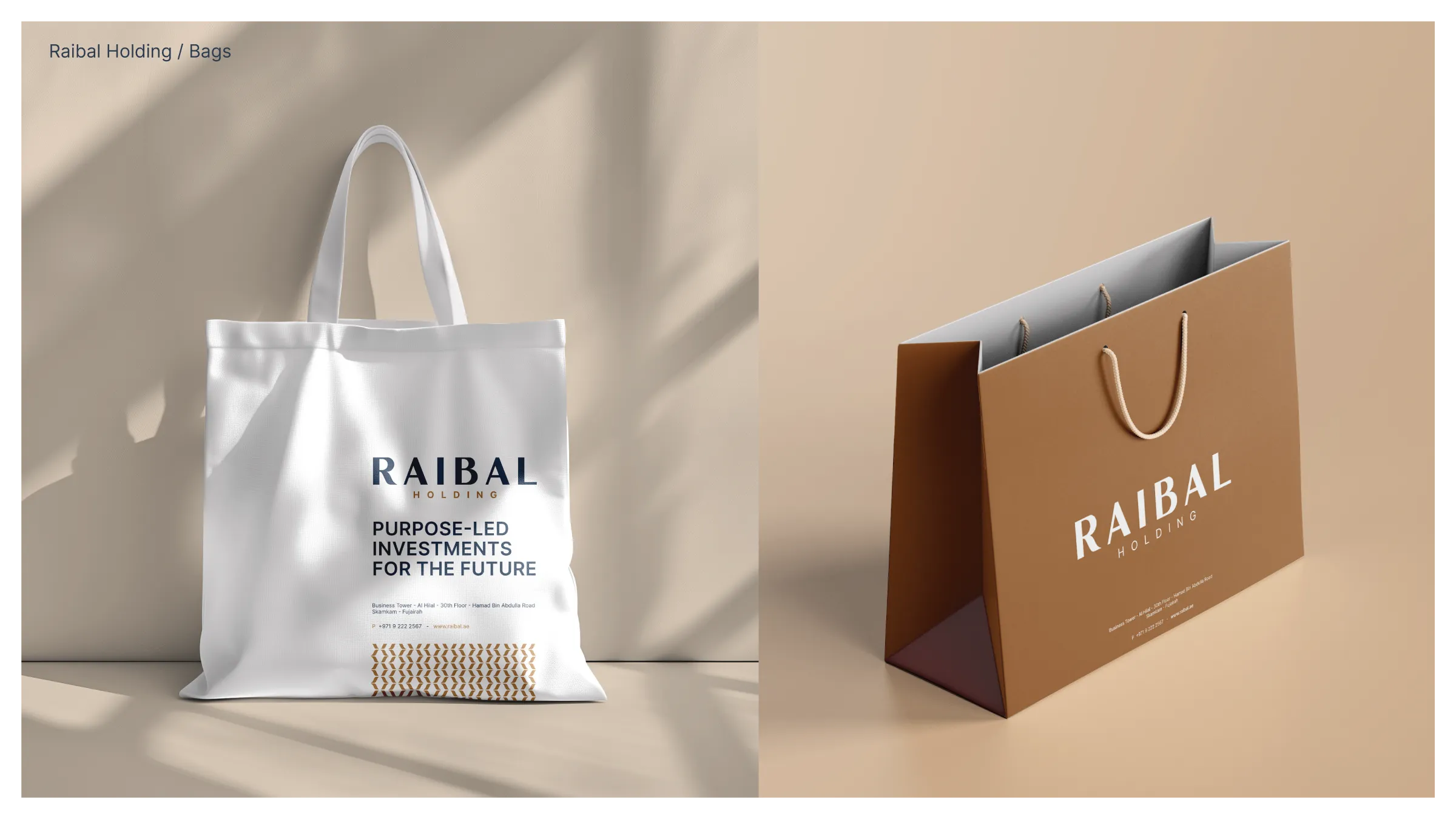
Raibal tote and paper shopping bag mockups in white and bronze with the wordmark and brand pattern.
The identity applied to tote and paper bags. Design mockups.

Rebranding

The project began with two routes: refine the existing bilingual identity, or develop a new visual direction. Lettering and symbol studies tested how Raibal could take on a more considered corporate presence.
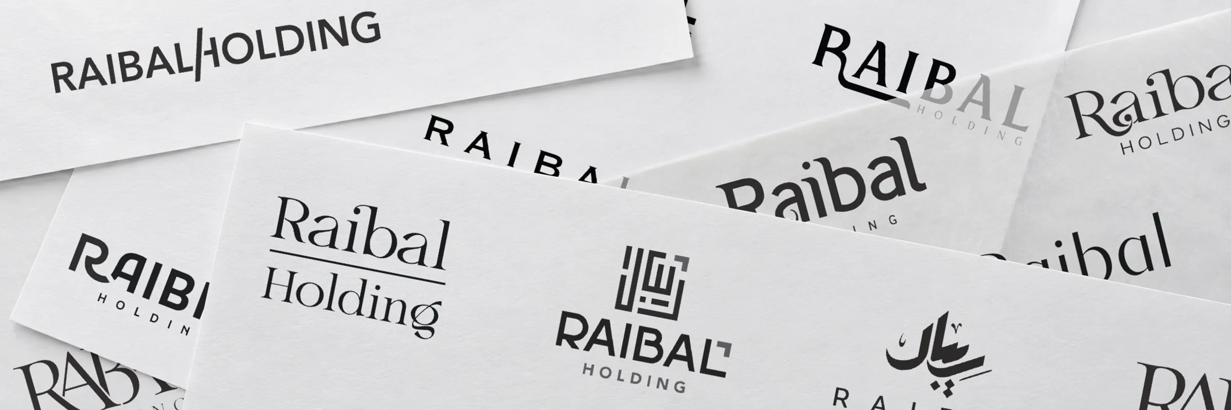
Overlapping sheets of Raibal logo explorations showing Arabic and English lettering and symbol directions.
Selected explorations, assembled from the logo development work.

Refining the familiar

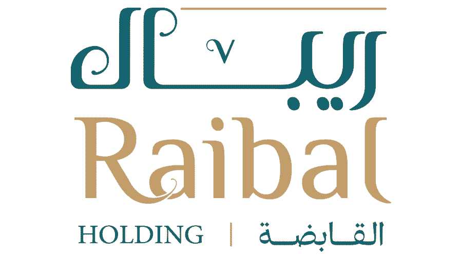
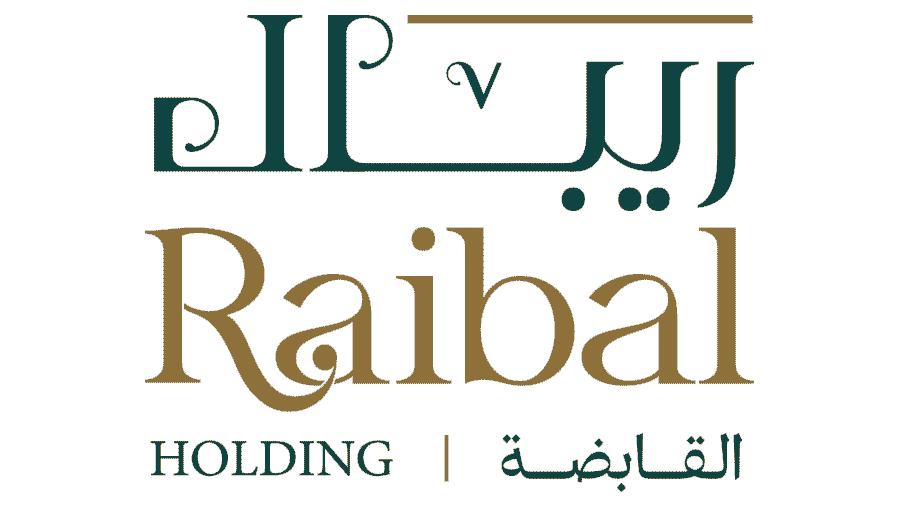
The first route retained the recognisable Arabic and English forms, adjusting proportions, contrast and detail for a more formal corporate expression.
Original identityRefinement study
Original Raibal Holding bilingual logo with teal Arabic lettering and a gold English wordmark.Refinement study of the original Raibal bilingual logo, with sharper lettering in deep green and gold.

Move across the image, drag the divider, or use the arrow keys to compare.

A new direction

The alternative route explored a geometric Arabic emblem, a separate ribbon-like symbol and a wordmark-led identity. The wordmark direction was selected.
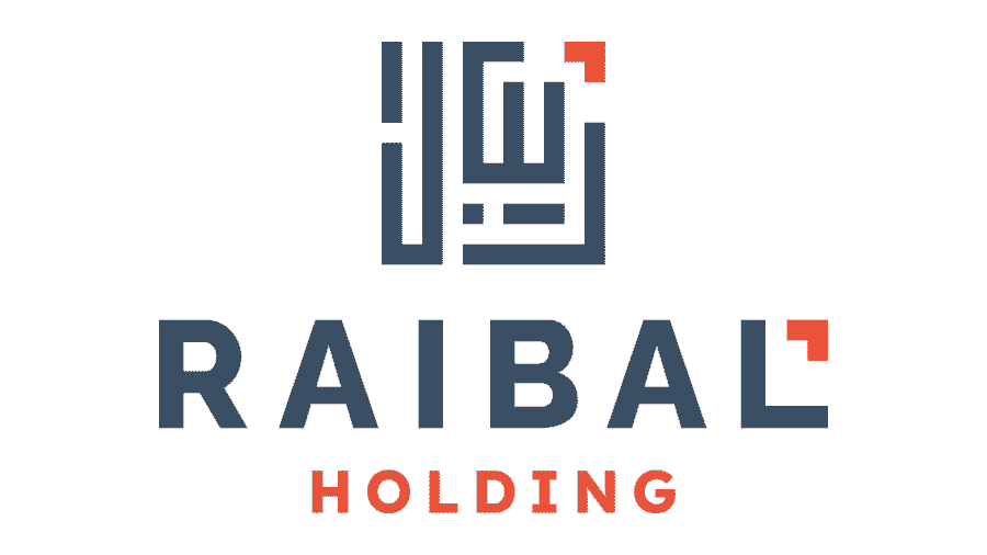
Raibal logo concept combining a geometric Arabic emblem with a navy English wordmark and orange accents.
Geometric emblem Exploration
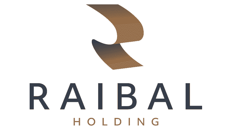
Raibal logo concept combining a folded ribbon symbol with a spaced English wordmark in navy and bronze.
Symbol & wordmark Exploration
Selected Raibal Holding identity with an uppercase navy wordmark and a bronze descriptor.
Wordmark-led identity Selected

The selected identity

A distinctive uppercase wordmark pairs sculpted letterforms with open spacing. English leads the identity; supporting Arabic and bilingual configurations extend the system across different communication needs.
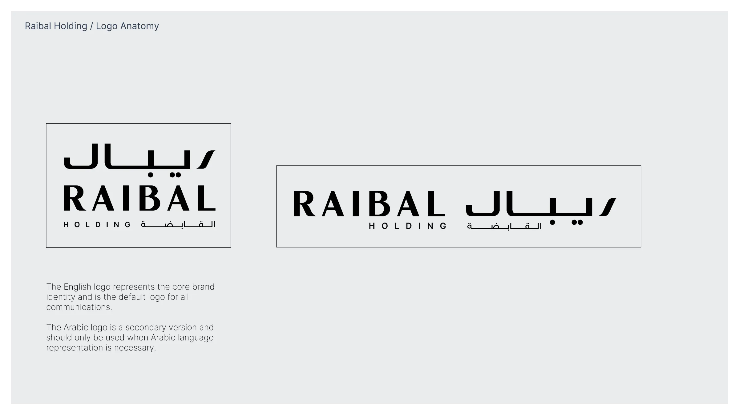
Selected Raibal Holding identity with an uppercase navy wordmark and a bronze descriptor.
The approved Raibal Holding wordmark.
Stacked and horizontal Arabic and English Raibal Holding logo configurations.
Supporting Arabic and English configurations — brand guideline extract.

Brand System
& Guidelines

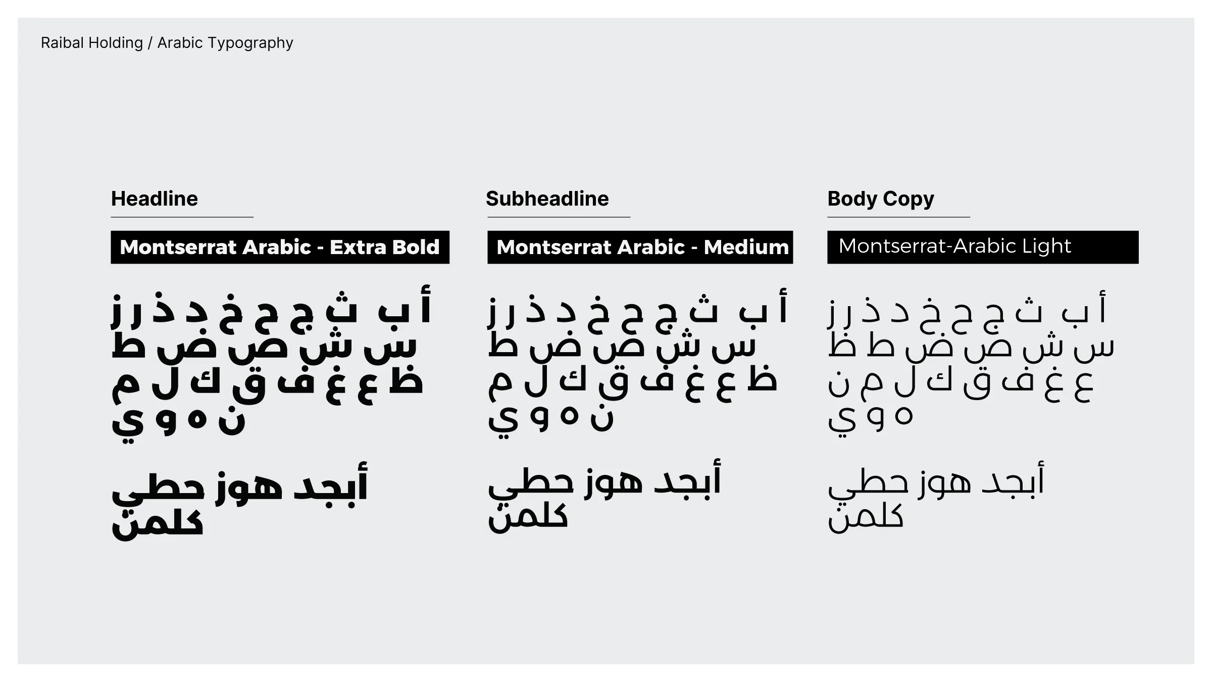
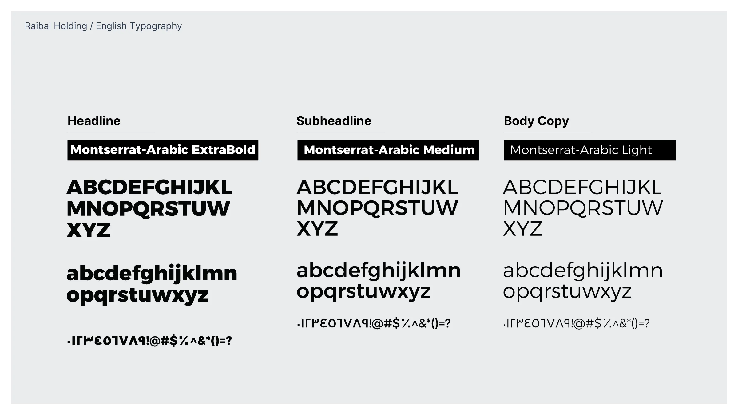
Navy and bronze anchor the palette. Montserrat-Arabic establishes a shared hierarchy across Arabic and English, while a repeating pattern carries the identity beyond the logo.

The guidelines define how these elements work together, from proportions and clear space to colour combinations and everyday applications.
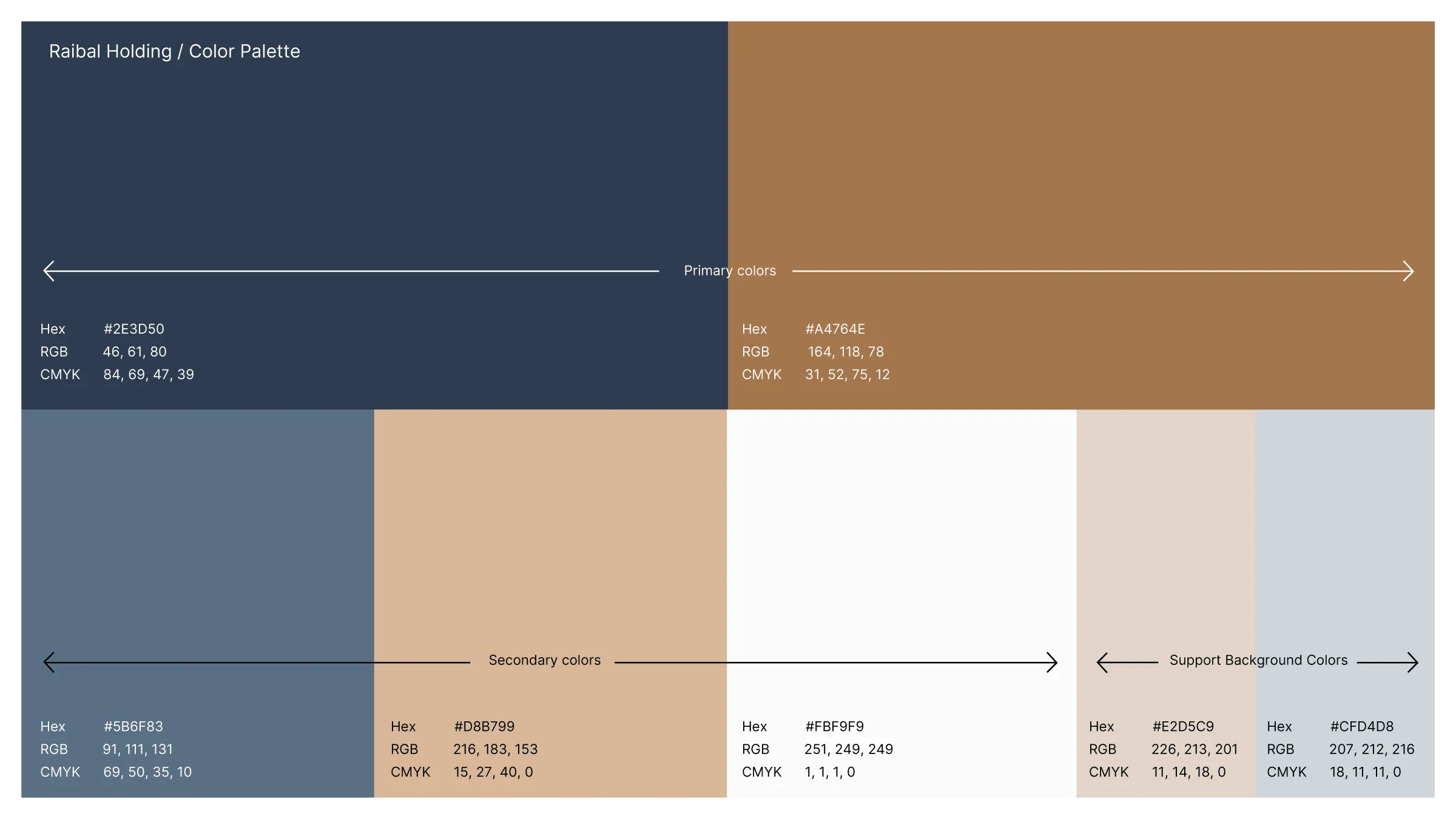
Raibal colour palette with navy and bronze primaries, blue-grey, sand and light neutral supporting colours.
Primary, secondary and supporting colours — from the final guidelines.
English Montserrat-Arabic typography in ExtraBold, Medium and Light weights.
English typography — ExtraBold, Medium and Light.
Arabic Montserrat-Arabic letterforms in ExtraBold, Medium and Light weights.
Arabic typography — the same three-level hierarchy.
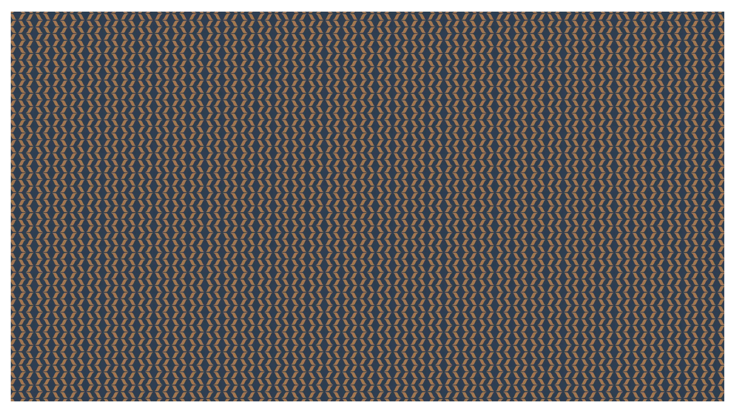
Repeating Raibal brand pattern in bronze on navy.
The repeating brand pattern in bronze on navy.
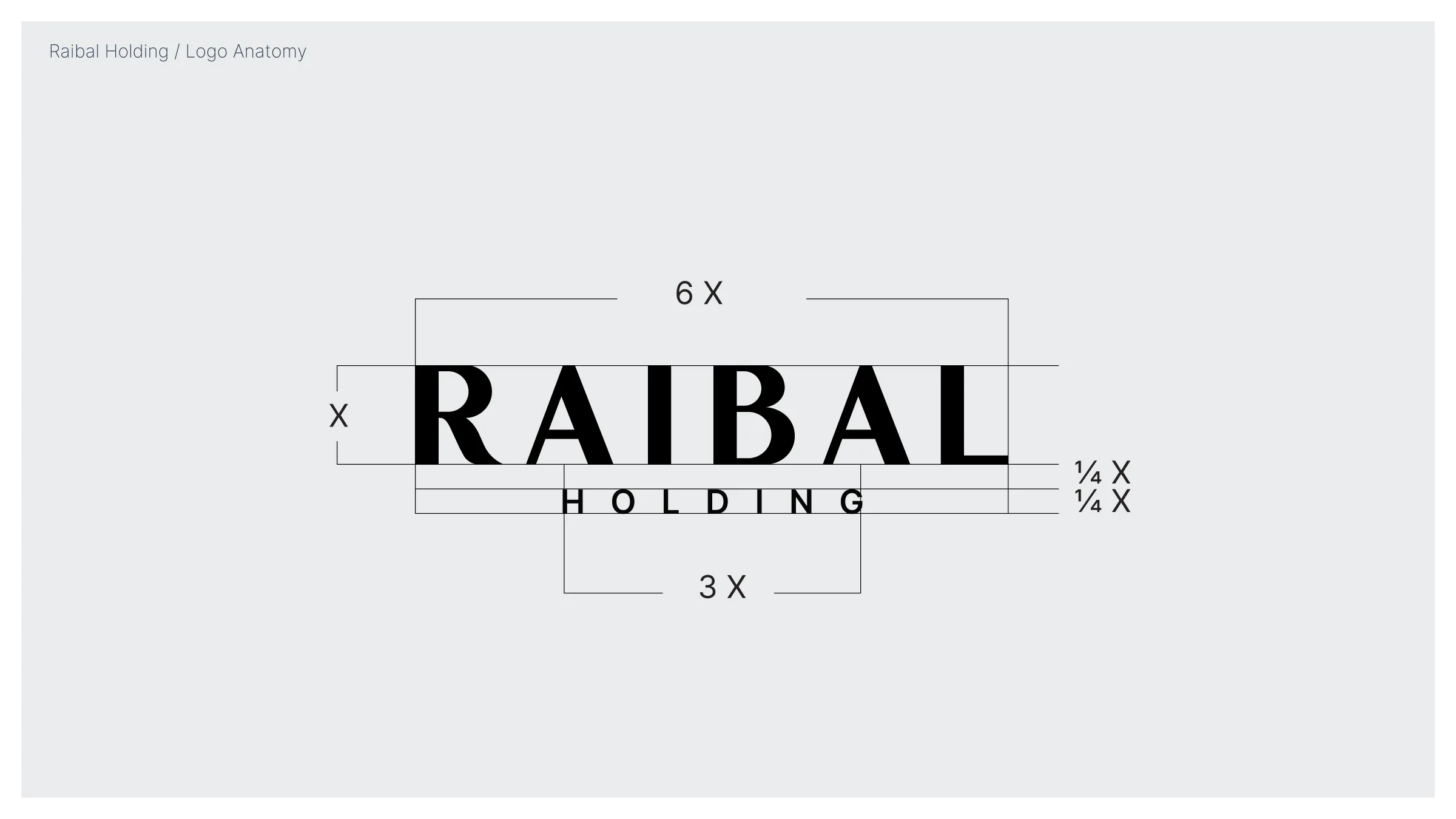
Raibal wordmark proportions, including the relative widths of RAIBAL and HOLDING.
Wordmark proportions.
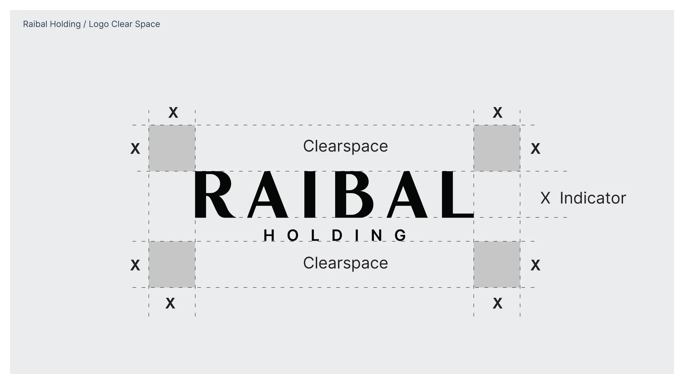
Minimum clear space around the Raibal Holding wordmark, measured with an X unit.
Clear space and consistent placement.
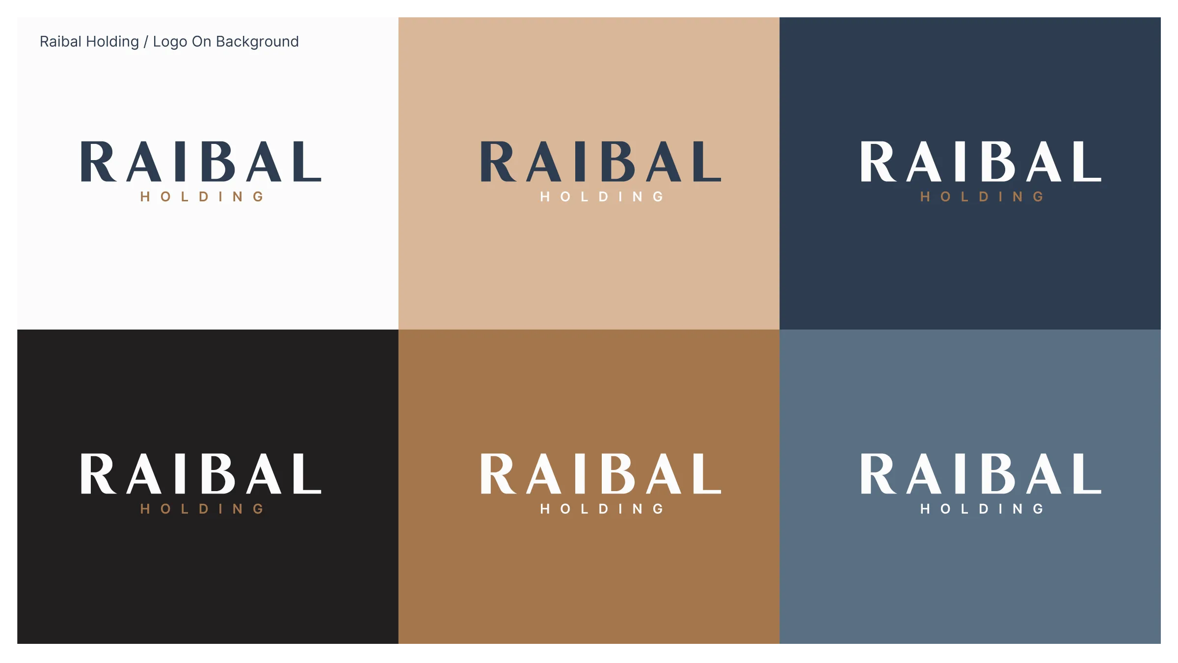
Raibal wordmark colour variations on white, sand, navy, black, bronze and blue-grey backgrounds.
Approved colour combinations across the brand palette.

Brand Rollout
& Launch

The system was extended across business stationery, presentation materials, notebooks and merchandise. Final artwork, prepared files and production guidance supported the move from design to production.

The applications below are design mockups and artwork presentations.
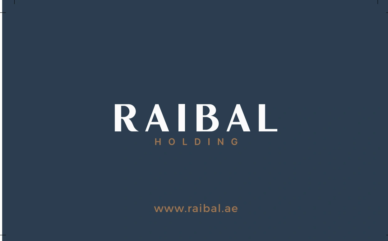
Raibal business card reverse with a white wordmark on navy.
Business card reverse — final artwork.
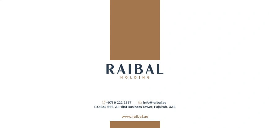
Raibal envelope artwork with the wordmark, bronze band and corporate information.
Envelope front — artwork extract.
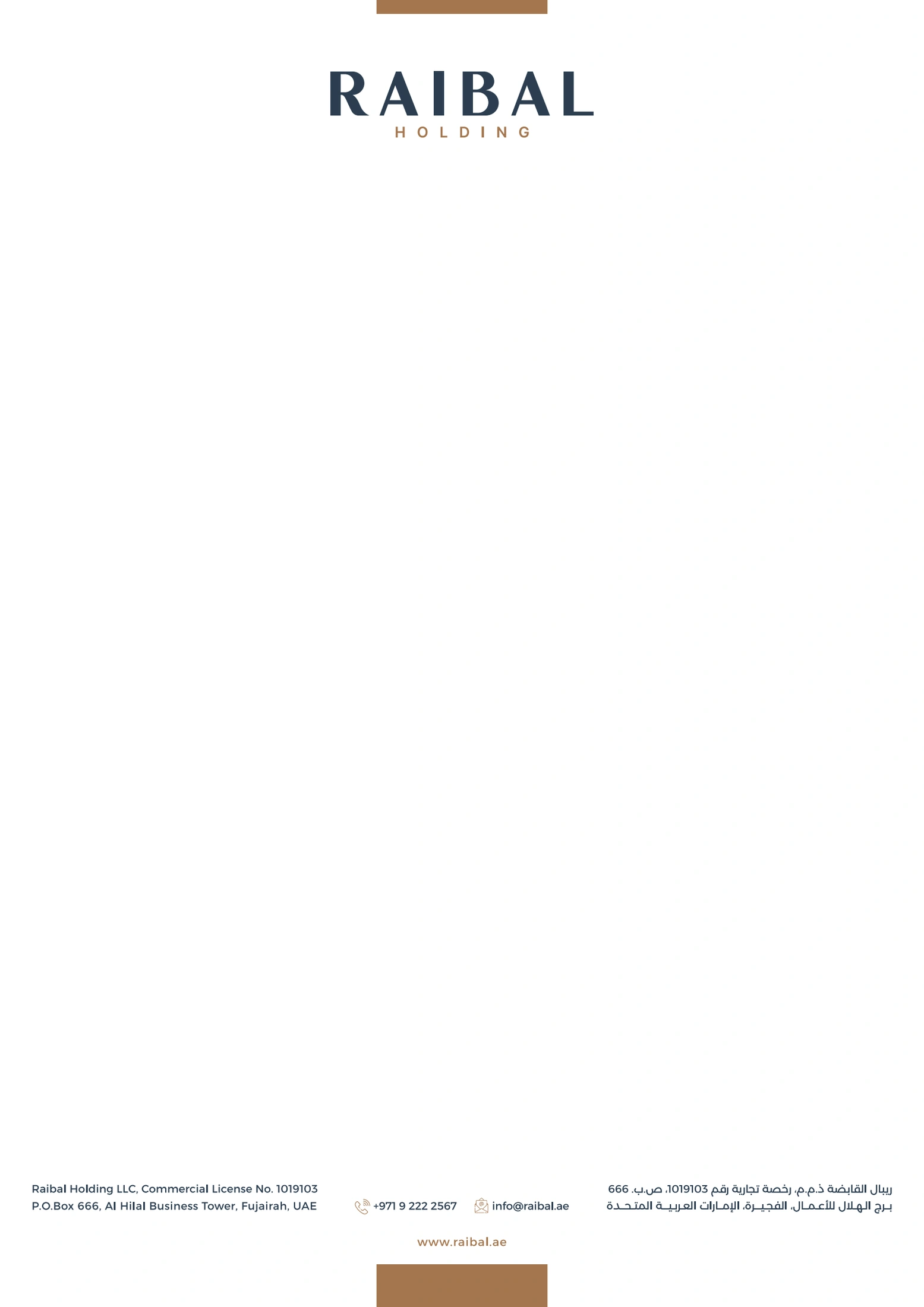
Raibal corporate letterhead with centred wordmark and a bronze accent.
Letterhead — final artwork.
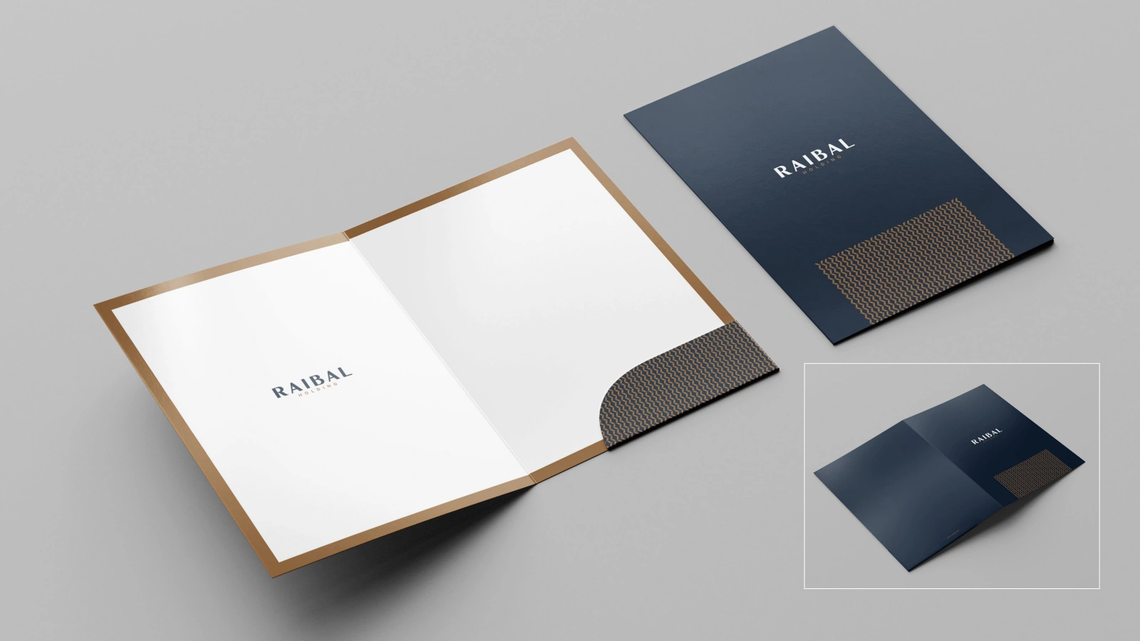
Mockup of open and closed Raibal folders with navy covers and a patterned inner pocket.
Corporate folder. Design mockup.
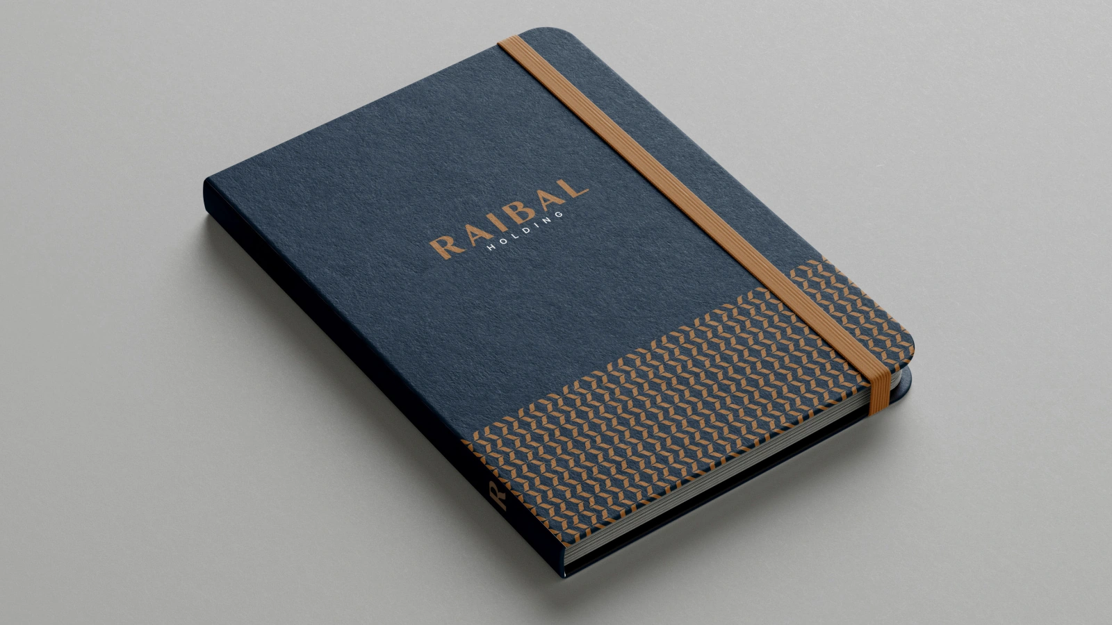
Navy Raibal notebook mockup with a bronze logo, lower pattern band and warm-toned elastic closure.
Notebook cover. Design mockup.
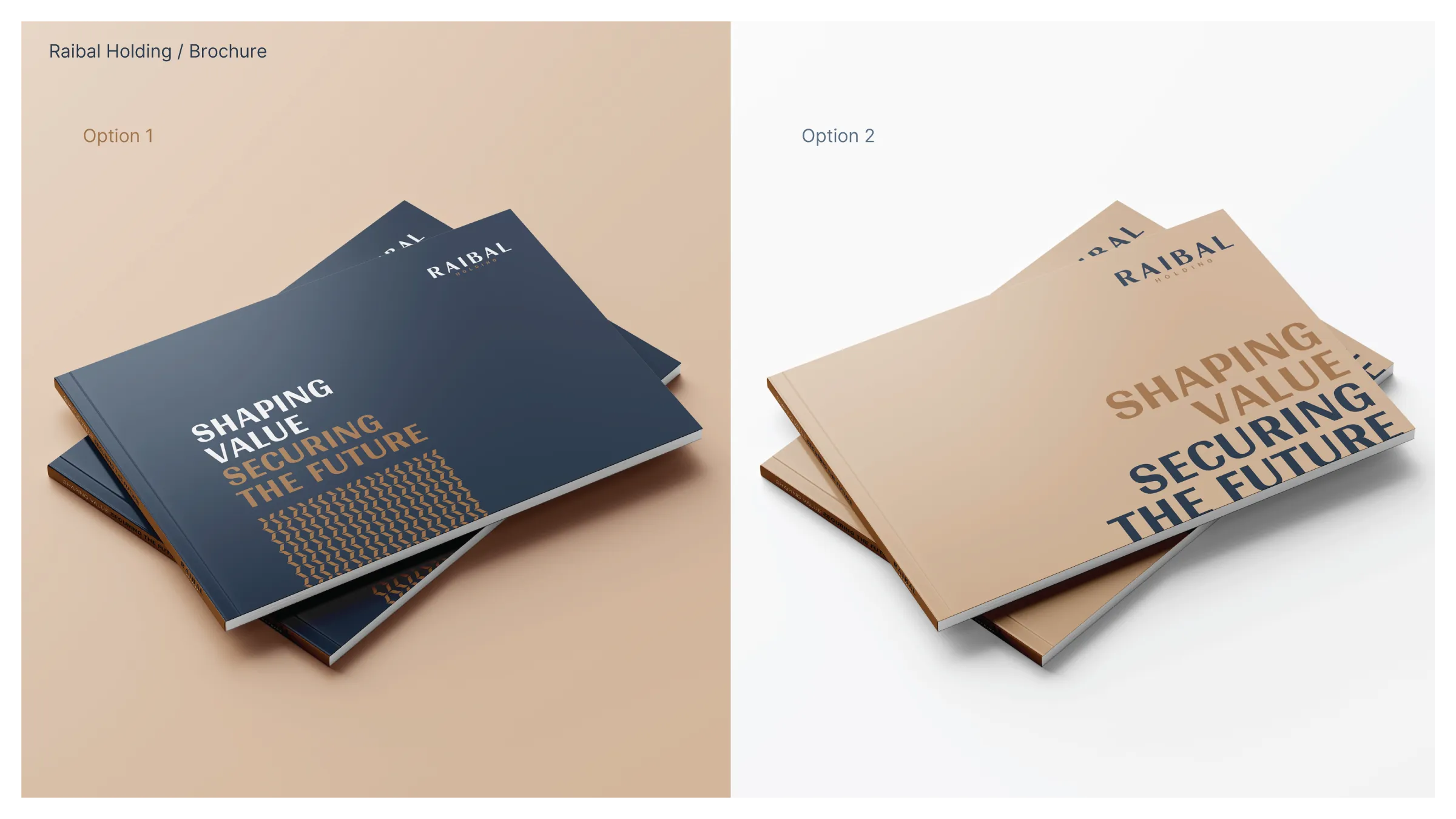
Two Raibal brochure cover mockups using navy and sand with bold typography and the brand pattern.
Brochure cover treatments in navy and sand. Design mockups.
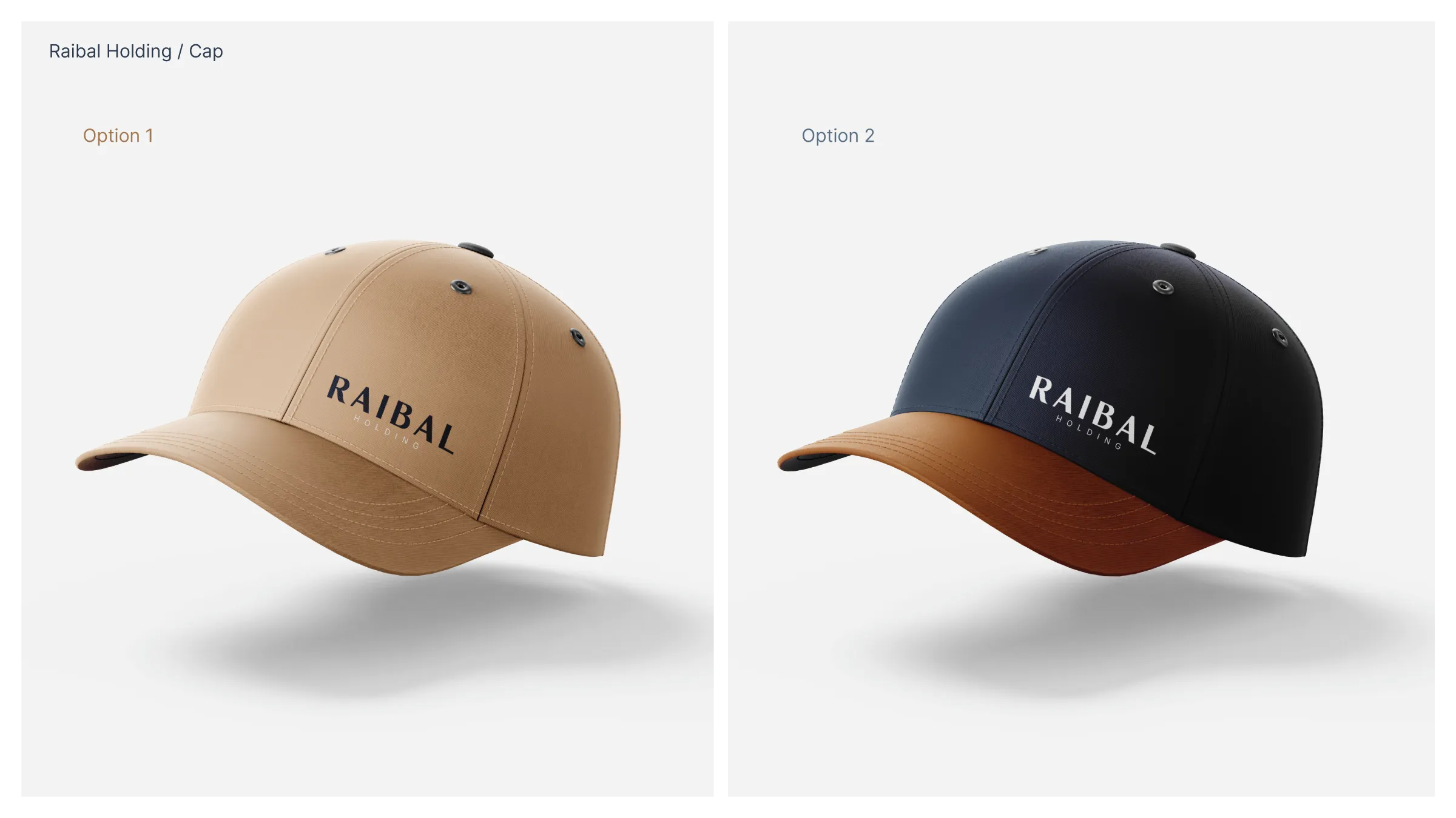
Raibal cap mockups in sand and navy, carrying the English wordmark.
Cap applications in two colour treatments. Design mockups.
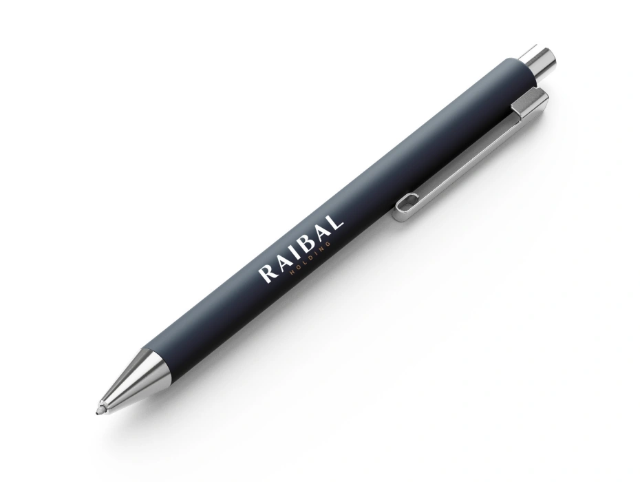
Navy pen mockup carrying the Raibal wordmark.
Pen application. Design mockup.
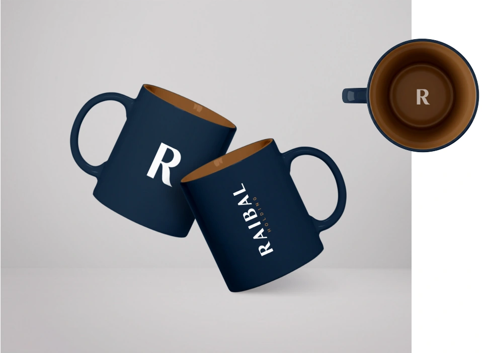
Raibal mug design visualisations using the wordmark and R initial.
Mug applications. Design visualisations.
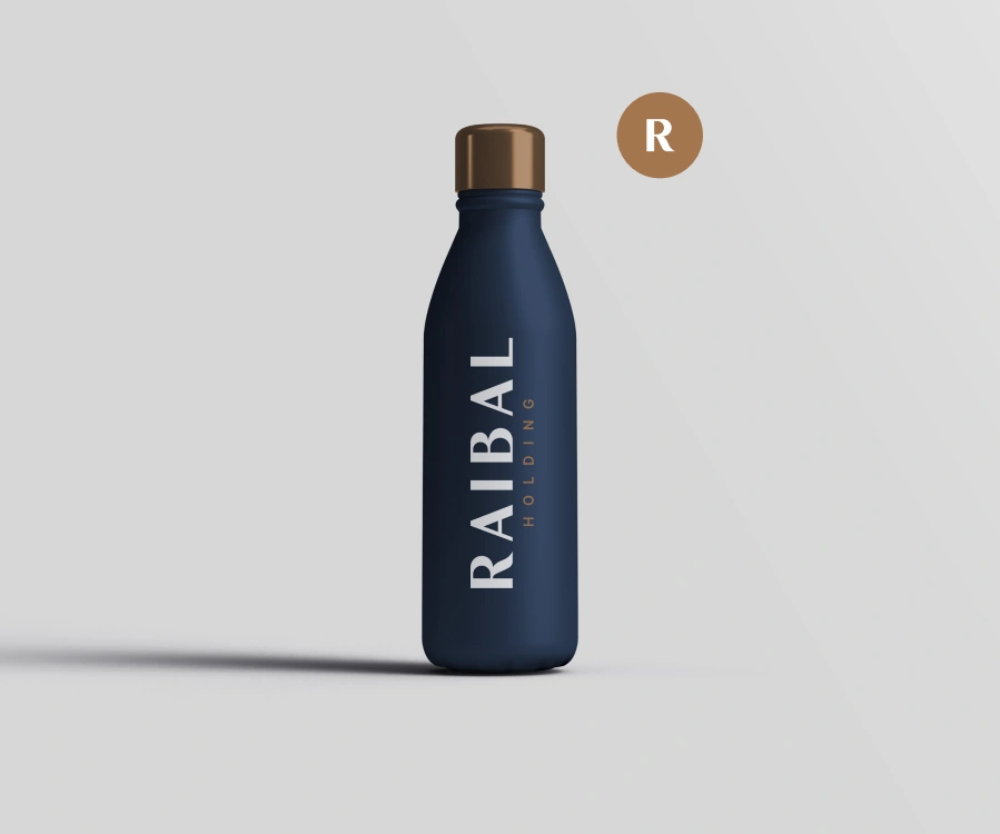
Bottle design visualisation with a vertical Raibal wordmark and bronze cap.
Bottle application. Design visualisation.

Digital applications

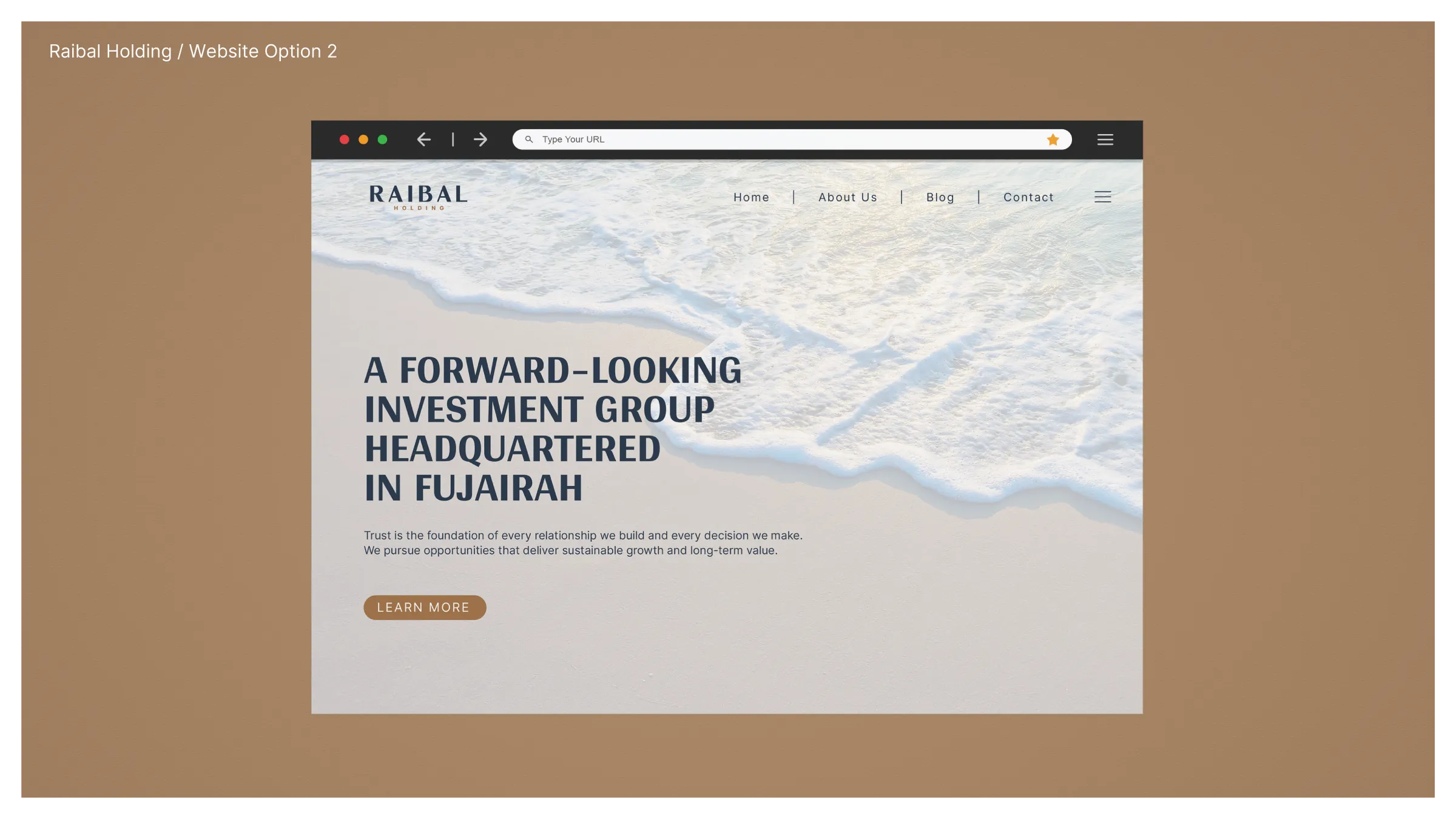
Website design studies translate the palette, typography and photographic direction to screen. Social media layouts and an editable document template extend the system across channels and day-to-day communication.
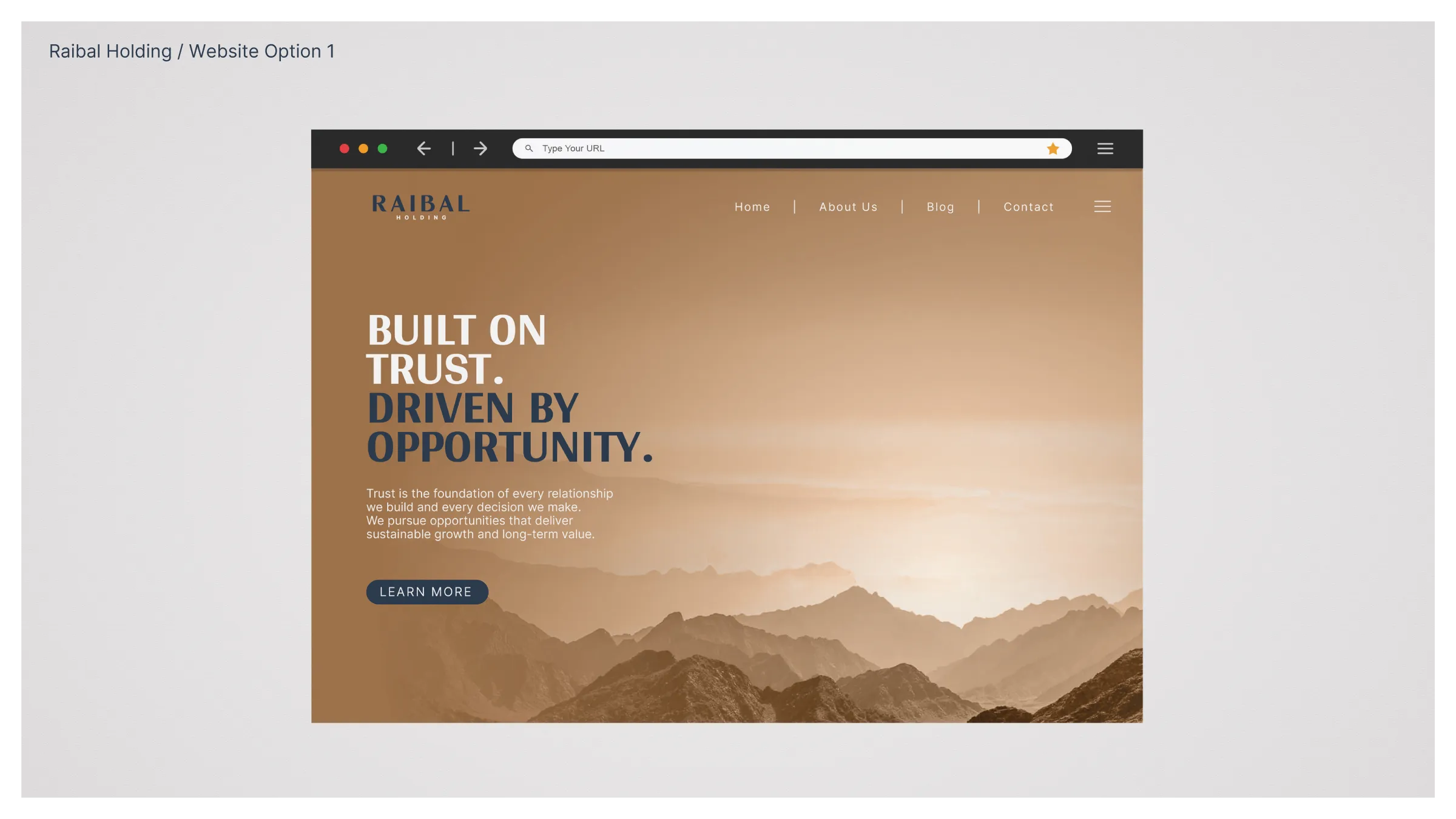
Raibal website concept with a mountain landscape, bronze palette and bold introductory headline.
Website design exploration — mountain landscape.
Raibal website concept with coastal photography and navy typography on a light background.
Website design exploration — coastal imagery.
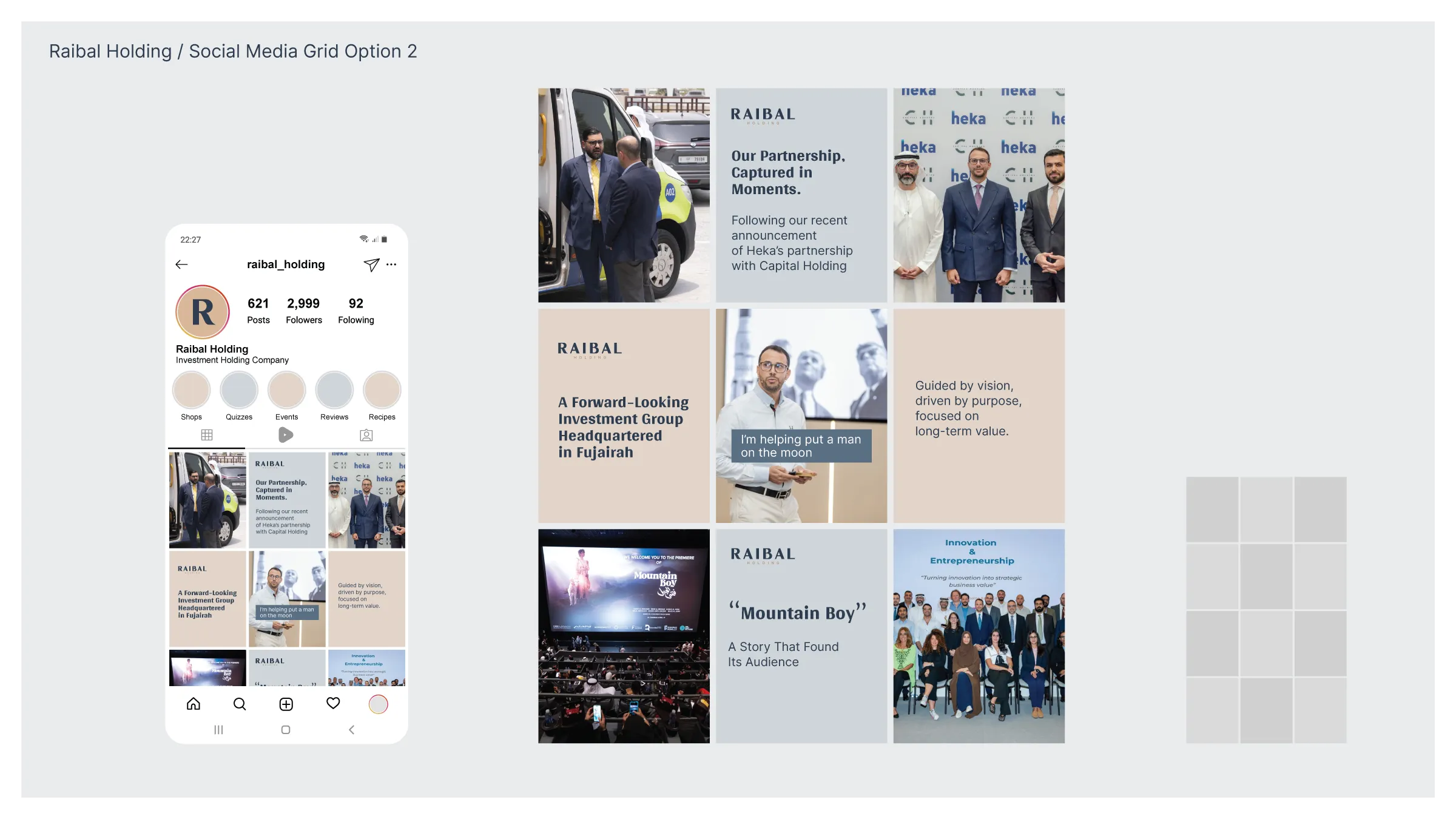
Raibal Holding social media design concept with an Instagram profile and a nine-post grid combining photography, typography and brand colours.
Social media grid and profile presentation. Design concept.
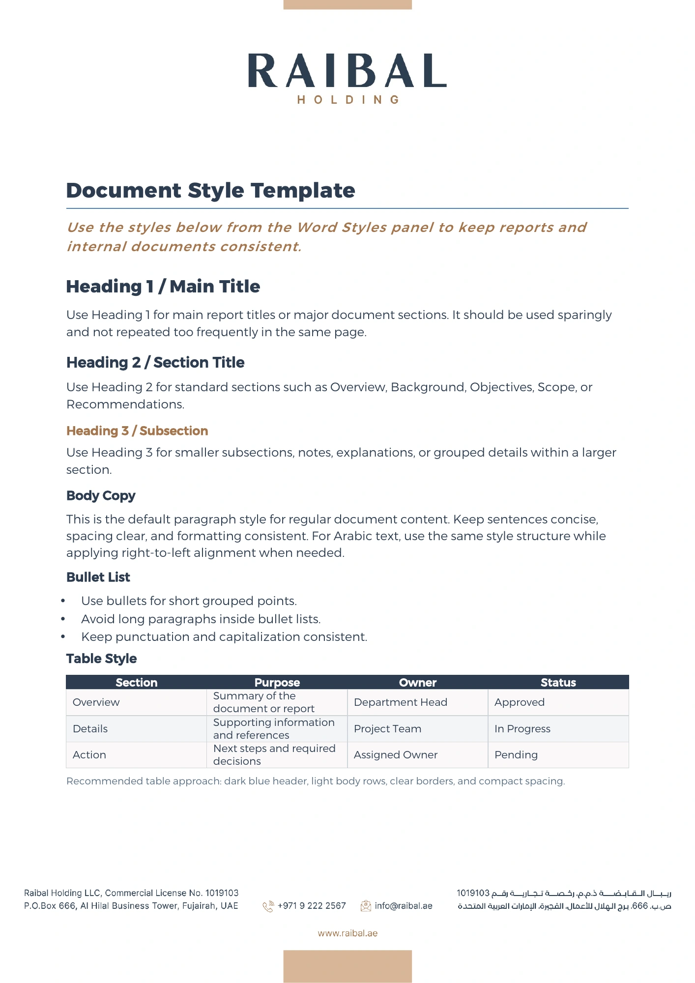
Raibal Word document template showing heading levels, body copy and a styled table.
Editable Word template with heading, body and table styles.

The identity in use

Raibal has begun launching the identity. The website is live, and all physical materials have been printed or produced.

Visit Raibal Holding ↗

Creative direction and design: , Nihad Taisir Studio. Scope included identity design, brand guidelines, application design, file preparation and delivery, and production guidance. Printing and manufacturing were carried out separately, outside the studio’s scope.

A bilingual corporate identity for Raibal Holding, from wordmark development and brand guidelines to print and digital applications.